The following graph shows the changes in global crude oil production since January 2001. The data source is the EIA International Energy Statistics downloaded in December 2012 http://www.eia.gov/cfapps/ipdbproject/iedindex3.cfm 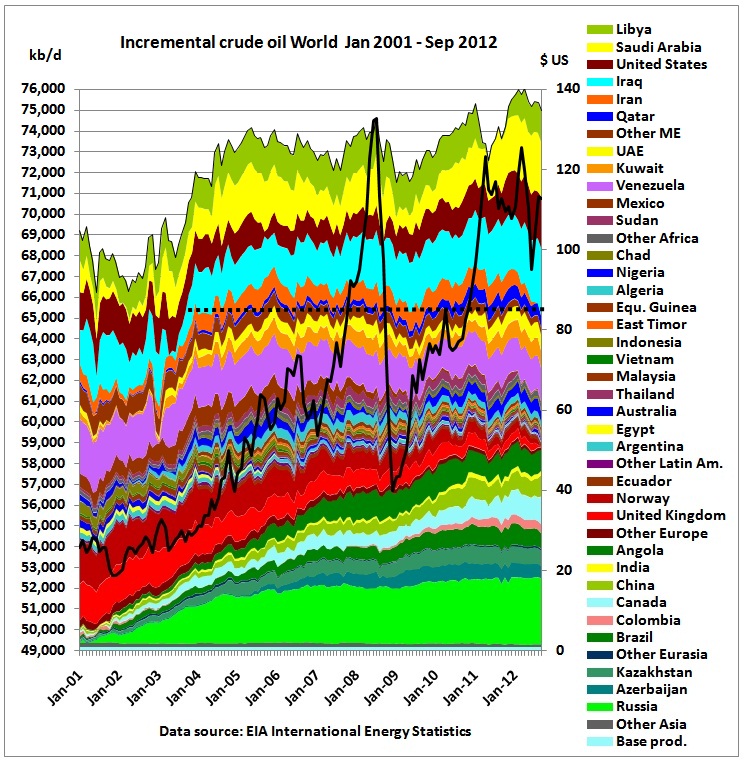 Countries have been stacked in following order:
- (hitherto) growing production. The 2009/2010 growth has slowed down. FSU is on a plateau for 2 years. Only growth potential seems to be from Canadian tar sands, at huge environmental cost and accelerating global warming
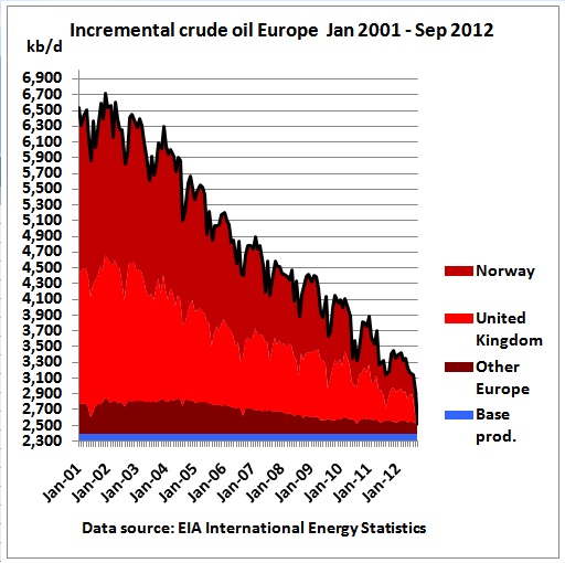
- declining production in many countries, especially in UK and Norway
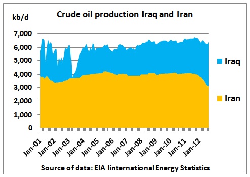
- Middle East. Iraq under-produced in the 80s and 90s, being able to increase production (limited by civil strife and internal conflict with the Kurdish North). Iran is on its 2nd and last oil peak, worsened by sanctions
- US with shale oil uptick
- Saudi Arabia with huge variations in incremental production.
- Libya. The production drop during the war was NOT offset by anyone else (no usable spare capacity in the global system)
The horizontal dashed line gives some orientation for the period back to 2005, when peak oil started. On balance, around 75% of global crude oil production in the 3rdquarter of 2012 was not higher than 7 years ago because growing production was offset by declining production elsewhere. Apart from Iran, the 3 countries which are decisive for the next years are the US, Iraq and Saudi Arabia.
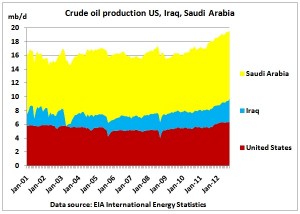 We see the US would have a long way to go overtaking Saudi Arabia. Iraq is a wild card.
Here are more details, continent by continent
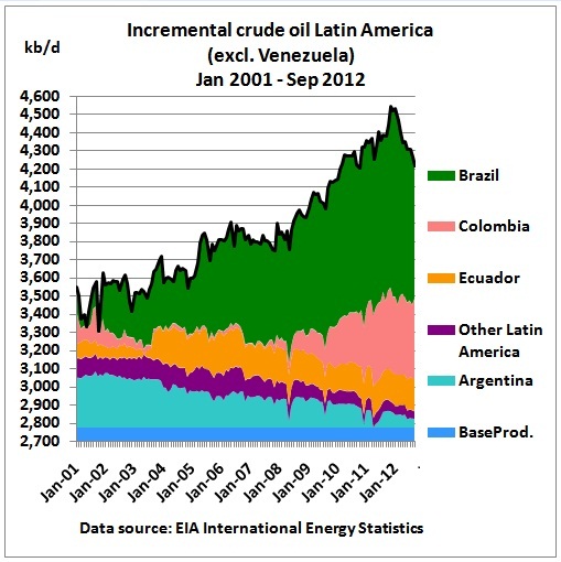 Argentina in decline, Colombian growth has stalled and Brazil’s surge has ended
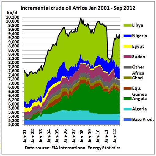 Africa including Libya seems to have peaked
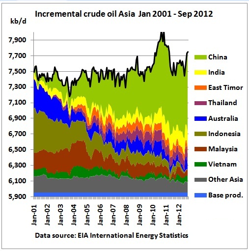 South East Asia has peaked long ago. This is the cause for a high Tapis oil price. China experienced a surge in 2010-11 but is expected to stay on a plateau in this decade.
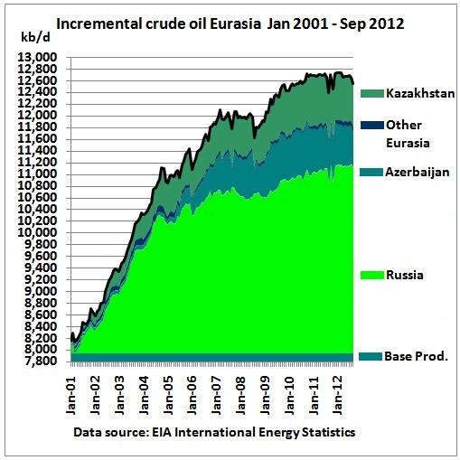 The former Soviet Union (FSU) seems to have reached a (2nd) peak
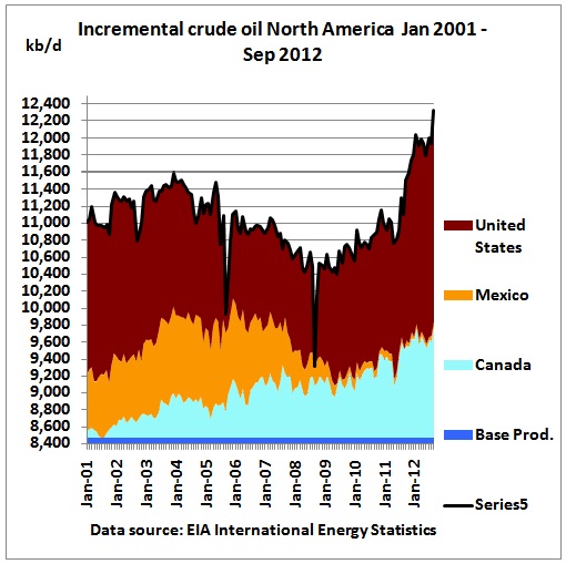 The US shale oil surge is clearly visible. Mexico’s decline after its peak has not been offset yet by Canadian tar sands
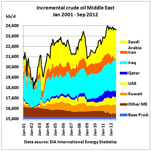 Other Middle East (mainly Oman, Syria, Yemen) declined – despite a rebound in Oman to 2001 levels – due to unrest and civil war in Yemen and Syria. On Saudi Arabia’s production: Aug. 2012 “This is strictly, totally business,” said Sadad Al Husseini, a former executive at Saudi Aramco, the state oil company. “Saudi production is flat out. Where you send it is a matter of where you make the best profit.” http://www.nytimes.com/2012/08/17/business/energy-environment/us-reliance-on-saudi-oil-is-growing-again.html?pagewanted=all&_r=0
Iraq’s production has been steadily increasing, while Iran’s dropped sharply as a result of the sanctions, exacerbating Iran’s second and last oil peak (negative feed back loop).
Decline rates
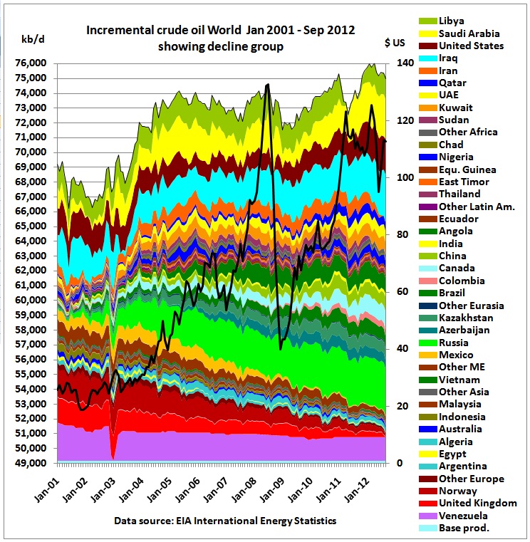 In this graph countries in decline are stacked first. The long-term decline rate (fairly linear) was 600 kb/d pa. This means that if all other countries stop growing, that will be the decline rate for the whole crude oil supply system.
Conclusion:
While the world is being told peak oil is dead, it is happening right now and plays havoc in countries with declining oil production. It keeps oil prices high – thereby damaging the world economy. What you see is what you get.
