This is the 1st post on the BP Statistical Review 2014 which has been published recently.
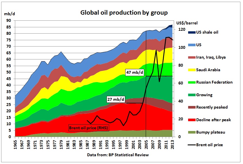
There are many reasons why oil prices went up in the last 10 years but the loss of 6.7 mb/d of production from a group of around 20 countries is definitely one of the factors. This group had a 26% share of total production in 2004, declined by 3.6% pa since then and has now a share of only 16%. But it kept busy a much larger, still growing group of now 31% share to offset this decline. For 9 long years, 47 mb/d (54% share) of flat, declining and offsetting oil production has practically not changed. Growth above this level has only come from the 3 top producers: Russia (+1.5 mb/d), Saudi Arabia (1.1 mb/d) and the US (+2.8 mb/d). Global average, albeit uneven, growth over these 9 years was a very modest 0.8% pa, which is the root cause for the ever stuttering world economy. The 2.8 fold increase in oil prices since 2004 gives us an idea what will happen when a larger percentage of countries peaks and then declines, not to mention when the global peak is reached.
In June each year BP publishes its Statistical Review with data up to the preceding calendar year. BP’s definition of oil includes “crude oil, tight oil, oil sands and NGLs (the liquid content of natural gas where this is recovered separately) but excludes liquid fuels from other sources such as biomass and derivatives of coal and natural gas”
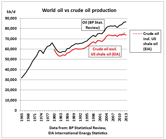
Total oil production does not show a peak although growth in 2013 was just 0.6% compared to 2.6 % the year before.
Fig 1: Oil as defined by BP vs crude oil as reported by EIA
Growth came only from US shale oil (much of it condensate sold at a discount) and natural gas liquids.
9 Feb 2014 Whole Lotta Splittin’ Going On – Gulf Coast Condensate Splitter Economics
https://rbnenergy.com/whole-lotta-splittin-going-on-gulf-coast-condensate-splitter-economics
Crude oil outside the US remained flat since 2005. This topic was covered in this post:
13/3/2014 World crude production 2013 without shale oil is back to 2005 levels
http://crudeoilpeak.info/world-crude-production-2013-without-shale-oil-is-back-to-2005-levels
Let’s have a look what’s hidden under the oil growth curve of Fig 1:
Fig 2: Oil production stacked by group and Brent oil price
In this graph oil producing countries are stacked by oil production changes (lower part up to 47 mb/d):
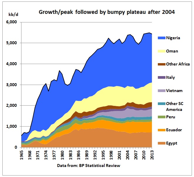
a) Bumpy production plateau
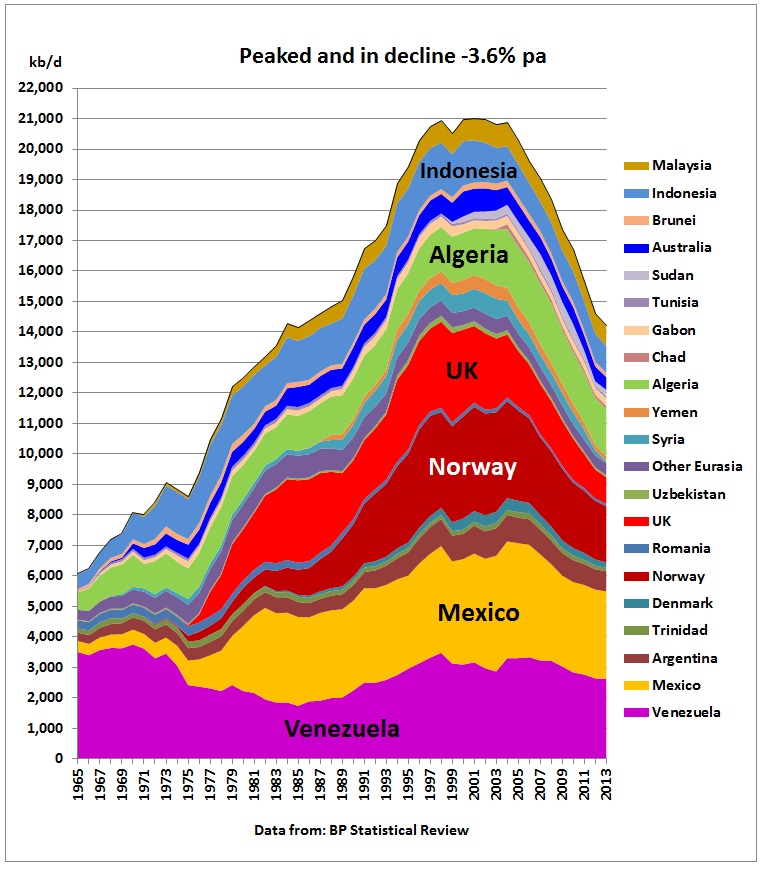
b) Peaked and in decline
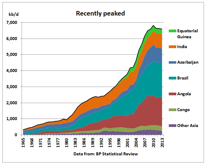
c) Recently peaked
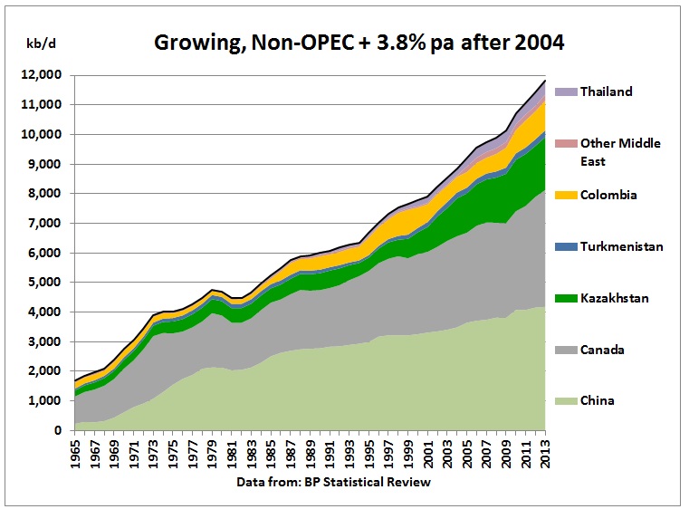
d) Still growing Non-OPEC
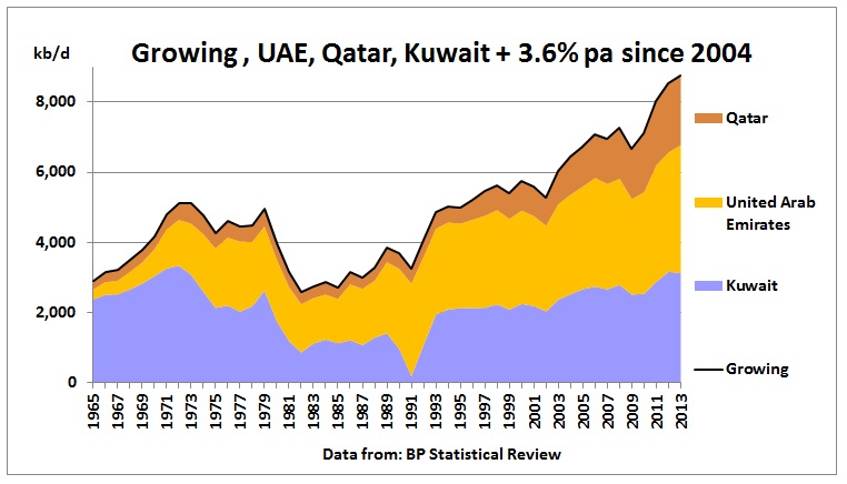
e) UAE, Qatar, Kuwait
followed by
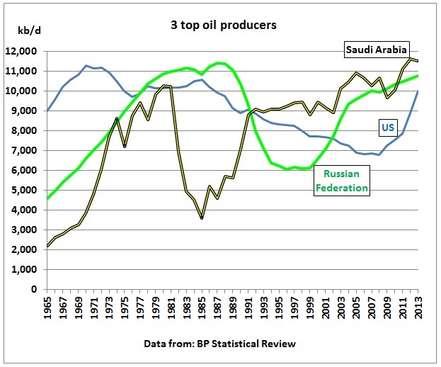
- 3 top producers (Russia, Saudi Arabia and US)
- 3 wild card producers (Iran, Iraq and Libya) where future oil production is dependent on geo-politics and therefore highly uncertain.
This grouping can change anytime.
In 2013, the declining group (b) was just 14.2 mb/d (16%) of global oil supplies, but it required a larger growing group (c+d+e) producing 27.2 mb/d (31%) to offset this decline. 32% of this offsetting growth came from UAE, Qatar and Kuwait.
For 9 long years, groups (a) – (e) with a total share of 54% (around 47 mb/d) increased production by only 640 kb/d.
Above that 47 mb/d line in the graph there were these changes between 2004 and 2013:
Russia +1.5 mb/d
Saudi Arabia +1.1 mb/d
Iran, Iraq, Libya -0.2 mb/d
US + 2.8 mb/d
The increase corresponds to an overall growth of just 0.8% pa over 9 years.
Fig 3: Group in which production peaked
The peak in this group started in 1998 and lasted 7 years until 2004. The average decline rate since then is -3.6% pa although this slowed down to -2.9% in 2013. The total loss in production was 6.7 mb/d
Fig 4: Bumpy plateau since 2004
Fig 5: Recently peaked (mostly offshore)
Fig 6: Growing, Non-OPEC
Fig 7: Growing 3 ME OPEC countries
Fig 8: The world’s 3 top producers. Saudi Arabia is still #1
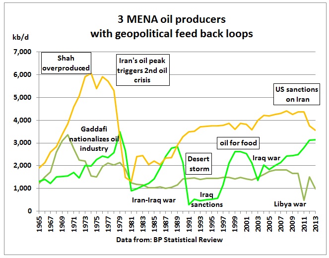
Fig 9: Twisted oil production history of 3 MENA countries
Libya’s oil production peaked when Gaddafi nationalized the oil industry. At the same time the Shah of Iran ramped up production which peaked in the mid 70s. It was one of the reasons for his downfall and the Iranian revolution which triggered the 2nd oil crisis. The Iran-Iraq war limited both Iranian and Iraqi oil production (Tanker war). The desert storm campaign and following sanctions on Iraq reduced Iraq’s oil production to very low levels while Iran’s oil production recovered. In the 1990s the oil for food sanctions continued to limit Iraq’s oil production. After the 2003 Iraq war it took many years to bring production back to previous levels. In the meantime, the nuclear standoff with Iran prompted the US to impose sanctions on Iran. The removal of Gaddafi brought about a drop of production in Libya.
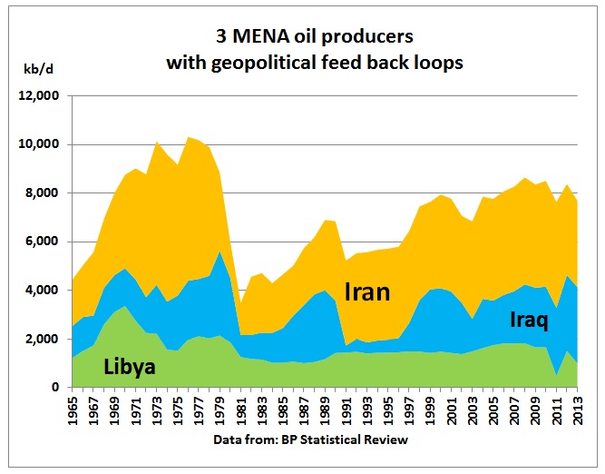
Fig 10: Stacked production profile of 3 MENA countries
The end-result of all these wars over oil are 100,000s dead and oil production in the last 10 years still 2 mb/d lower than in the 1970s.
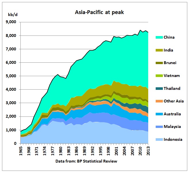
Fig 11: Asia Pacific at peak
The Asian Century is peaking. Everything will depend on oil imports from the Middle East.
Conclusion:
The seemingly ever growing oil production is deceiving. The process of peaking is happening right under the growth curve. One has only to look for it. Once hitherto growing countries enter the plateau phase, the underlying decline will become visible in the global curve. That will be a surprise for many governments who take oil supplies for granted and think there will be enough time for solutions when it happens.
