BP Statistical Review: proved reserves not so proven
We start with what most people will do, the BP Statistical Review (latest version June 2016). The review’s Excel file contains a work sheet named “Oil – proved reserves history”. Let’s put that into a graph.
Oil: Proved reserves
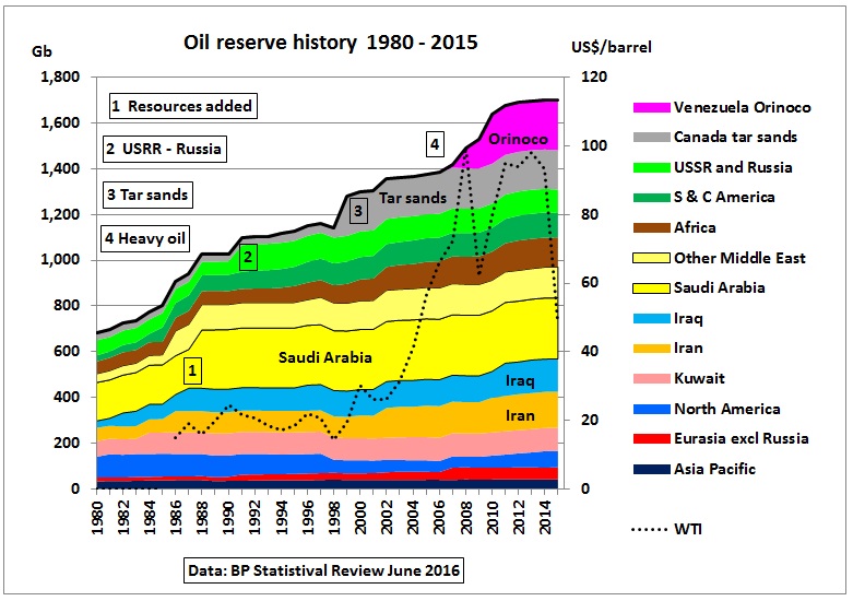
Fig 1: So-called proved reserve history in BP’s Statistical Review June 2016
WTI oil prices have been added as a dotted line. We see that despite ever increasing (remaining!) oil reserves oil prices started to go up around the year 2000. So something is wrong here. What matters are annual (even monthly) oil flows, not what companies or countries write in their reserve books.
The above graph is generated from a table with following fine print notes at the bottom:
“Total proved reserves of oil – Generally taken to be those quantities that geological and engineering information indicates with reasonable certainty can be recovered in the future from known reservoirs under existing economic and operating conditions. The data series for total proved oil does not necessarily meet the definitions, guidelines and practices used for determining proved reserves at company level, for instance as published by the US Securities and Exchange Commission, nor does it necessarily represent BP’s view of proved reserves by country”
Source of data: “Primary official sources, third-party data from the OPEC Secretariat, World Oil, Oil & Gas Journal and an independent estimate of Russian reserves based on official data and Chinese reserves based on information in the public domain. Canadian oil sands ‘under active development’ are an official estimate. Venezuelan Orinoco Belt reserves are based on the OPEC Secretariat and government announcements.
http://www.bp.com/en/global/corporate/energy-economics/statistical-review-of-world-energy.html
In other words: these are NOT proved reserves but a mixture of different categories and types of oil, some from unreliable sources, including probable and possible reserves and even resources. They should actually not be added up.
Nevertheless, BP’s Review reserves are often used by governments and quoted in the media.
An example is the flawed Australian Energy White Paper 2004 (signed by then Prime Minister Howard) which used BP review reserves of 1050 Gb in 2002 to conclude that “there are sufficient reserves to supply world demand for around 40 years”. Already 3 years later oil supplies were no longer sufficient and oil prices went up relentlessly which caused the US recession end 2007. So we have to deal with these oil reserve problems and how they are mis-used.
Add more oil into the mix
Fig 1 shows distinctive kinks:
- OPEC’s paper barrels, around 300 Gb of resources added during the oil quota war in the 80s during an oil glut after the 2nd oil crisis
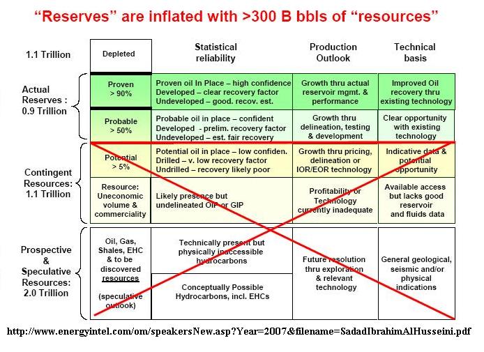
Fig 2: OPEC’s resource inflation
Fig 2 is from Sadad-al-Husseini (ex Saudi Aramco) published in 2007.
Even the IEA acknowledged this problem in its WEO 1998, page 93
I personally handed over the above graph (Fig 2) to the then Australian Prime Minister Kevin Rudd at a Cabinet Community Meeting in 2010. My paper ended up on a big heap of files and no action was ever taken. Even today, this problem hangs like a Damocles sword over the Middle East oil supply system.
- Changes from USSR to Russia
- Adding tar sands from Canada. Out of 166 Gb only 24 Gb are under active development
Tar sands make climate change ‘unsolvable’: Hansen
“The potential amount of carbon in these unconventional resources is huge,” Hansen told the Environmental Audit Committee. “If we introduce the tar shale and the tar sands as a source and exploit those resources to a significant extent, then the problem becomes unsolvable.”
(4) Adding Orinoco heavy oil from Venezuela, now 222 Gb

Fig 3: El comandante demonstrando petroleo extrapesado
This heavy oil needs a diluent to be pumped (appr. 2.5 – 3 million barrels per month). In a press release by Reuters earlier this year we read:
18/1/2016
‘Venezuela’s state-run company PDVSA has requested its partners in at least a half dozen joint ventures pay for naphtha imported to produce exportable crudes amid a punishing oil price crash, according to sources and a company letter seen by Reuters.
http://www.reuters.com/article/us-oil-venezuela-naphtha-exclusive-idUSKCN0UW1LE
SPE classification of oil
So what’s the proper classification of oil reserves and resources? The following graph shows the resources classification framework of the Society of Petroleum Engineers:
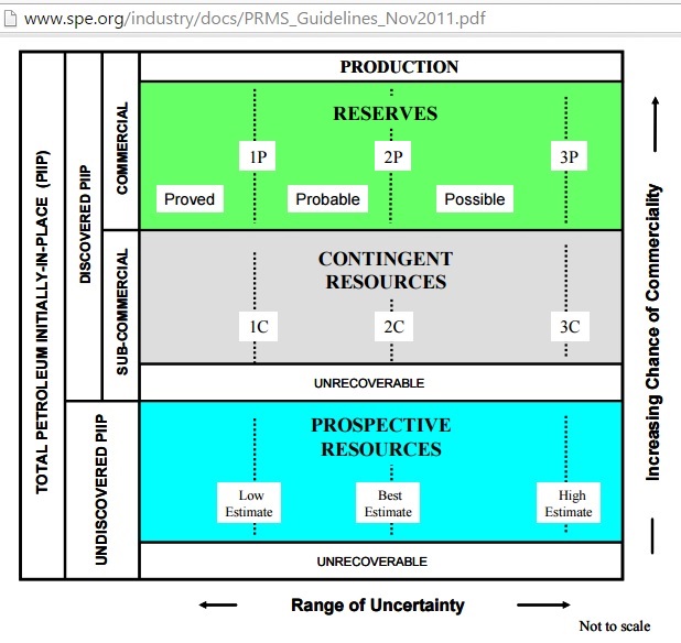
Fig 4: SPE classification of reserves and resources (“production”=past production)
Calculating reserves is a science in itself, but basically a statistical exercise using probabilities:
- 1P (proved) and 1C: At least a 90% probability that the quantities actually recovered will equal or exceed the low estimate
- 2P (proved + probable) and 2C: At least a 50% probability that the quantities actually recovered will equal or exceed the best estimate
- 3P (proved + probable + possible) and 3C: At least 10% probability that the quantities actually recovered will equal or exceed the high estimate
Only mean reserves (2P) can be added.
http://www.spe.org/industry/docs/PRMS_Guidelines_Nov2011.pdf
A comparison of classifications used in different countries can be found here:
Society of Petroleum Engineers
Oil and Gas Reserves Committee Final report 2005
http://www.spe.org/industry/docs/OGR_Mapping.pdf
IEA’s hot oil resources and reserves
What does the International Energy Agency (IEA) say about oil reserves? In the WEO 2015 (November) it’s summarized in this table
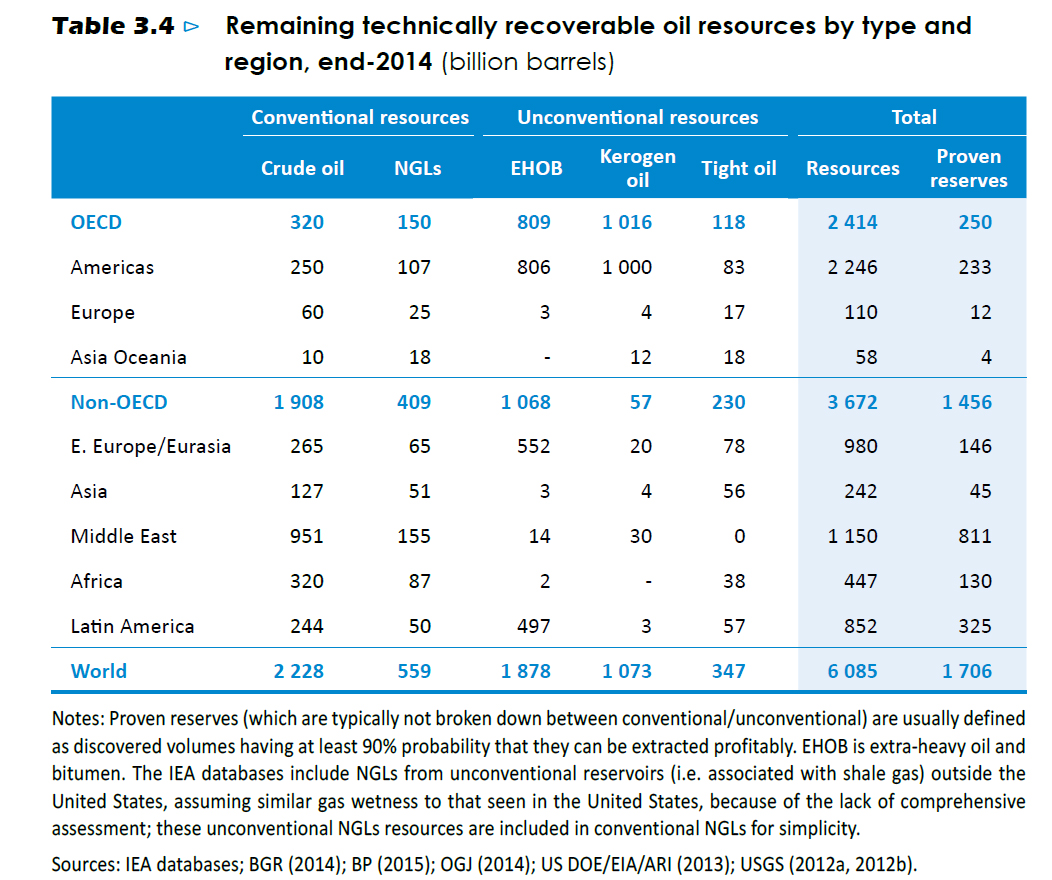
Fig 5: WEO 2015 reserve and resource table
http://www.worldenergyoutlook.org/
It’s basically the same “proven” reserves as in the BP Statistical Review. Even worse, different types of oil are given as resources, not reserves. It’s mostly a carbon copy of the same table in the WEO 2014 a year earlier. Why proven reserves can’t “typically” be broken down into conventional and unconventional oil is also not clear. This is important because unconventional oil has different production profiles. IEA could have done better by adhering to the SPE classification. This is even more puzzling as the WEO 2014 contains a classification table (Petroleum Resource Management System) in table 3.8 (p 113) which is very similar to Fig 4. So why was that work not done according to PRMS?
What is more concerning is that the total resources given – if burned – will bring planet Earth far beyond a warming of 2 degrees. IEA’s own WEO 2015 special report on Energy and Climate Change states on page 12:
“….the world’s estimated remaining carbon budget consistent with a 50% chance of keeping the rise in temperature below 2 °C is consumed by around 2040”
So why estimate oil resources if they can’t be used?
Rystad oil reserve table
Let’s turn to a table published on 4/7/2016 by Rystad Energy, a Norwegian consultant:
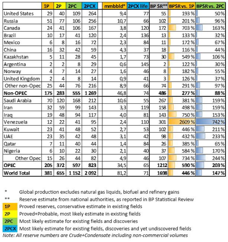
Fig 6: Rystad’s oil reserve and resource table
The table shows that the BP Review’s “proven” reserves are overstated by more than 400% , most notably by Venezuela, Canada, Iraq and Nigeria.
Using data from the above table, let’s display the reserve life of 2P reserves for the next 20 years:
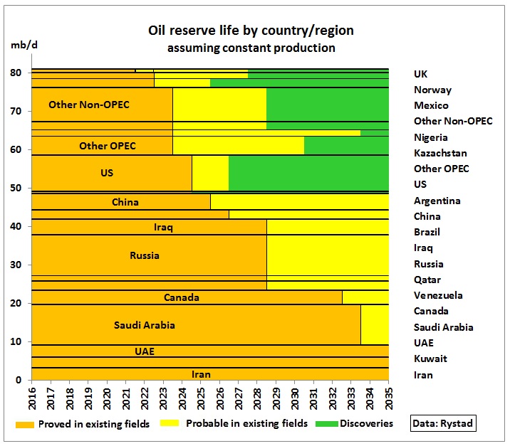
Fig 7: Oil reserve life using Rystad data table
On the vertical axis we have the current oil production (assumed to be constant), on the horizontal axis the reserve life. We can see that proven reserves are almost depleted by 2035 and that for 32 mb/d of production (40%) even the probable reserves start to run out already 10 years from now. Note the yellow bars represent the incremental probable reserves.
Of course oil production of proved reserves will not remain constant. The following graph shows how 1P production declining at an assumed 3% pa is successively replaced by production of probable reserves, also declining at 3% pa. When 2P reserves are exhausted in each country or region discoveries have to be turned into 2P reserves and developed in a timely manner.
The IEA never “likes” to show total oil production declining so let us do the same and assume that total production from all 3 sources can be maintained.
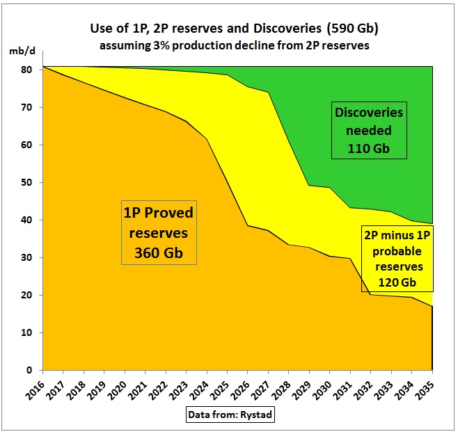
Fig 8: Theoretical model how proved and probable reserves could be produced
Of course, different decline rates would yield different results. If, for example, decline rates of probable production were zero, this would increase its accumulated consumption to 2035 to 150 Gb. Discoveries needed would correspondingly drop to 80 Gb. The kinks in the curves are caused by 1P and 2P reserves depleting in certain countries as shown in Fig 7.
This looks quite similar to a graphic representation of table 3.5 from the IEA WEO 2015 (excluding much of the NGLs).
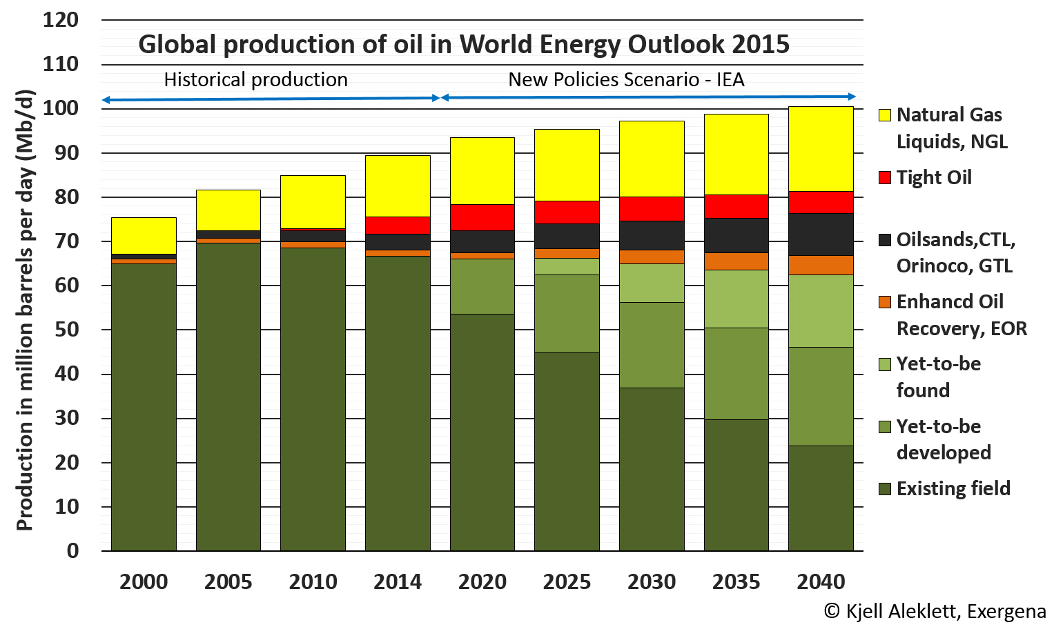
Fig 9: Oil production in the WEO 2015 New Policies Scenario
The IEA apparently assumes more probable reserves and a smoother transition between reserve classes. This suggests that they did not do a country by country analysis which would have been important because in Fig 3.9 of the earlier WEO 2014 report the IEA shows annual discoveries at less than 30% of annual production (appr. 30 Gb).
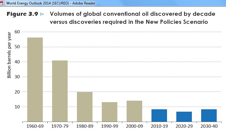
Fig 10: Discoveries of conventional oil
For Fig 8 this level of discoveries means that they may not be enough by the end of the next decade.
The above uncertainties are exacerbated by oil price risks. Earlier in 2016 Rystad had released an interactive graph in an article titled:
Adjusting the taps on oil price
http://www.economist.com/blogs/graphicdetail/2016/01/daily-chart-6
Rystad oil price graph
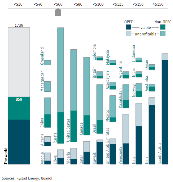
Fig 11: Economically viable oil reserves for $60 Brent oil price (in Gb)
http://www.rystadenergy.com/NewsEvents/PressReleases/the-economist—oil-reserves-chart-
Let’s use the interactive chart to generate a couple of graphs.
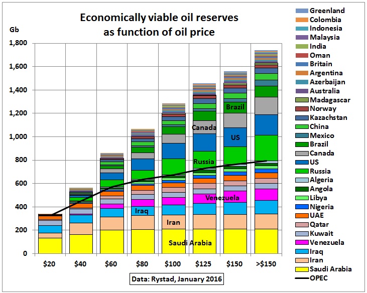
Fig 12: Economically viable oil reserves as function of oil price
The above graph shows for each oil price the amount of reserves and where they would come from. The black line separates OPEC and Non-OPEC. As oil prices go up, more Non-OPEC oil would become available. The maximum in the >$150 oil column is 1.74 Gb, somewhere between 2PC and 2PCX reserves/resources in Fig 6 and incidentally equal to the BP Review reserves. The world just ended an experiment with >$100 oil so the likely maximum we can expect would be lower than 1.3 Gb. At current prices of $45 we would get just enough oil to cover the next 20 years ie. 590 Gb (in Fig 8) which means that oil production would have to fall much earlier to stretch the reserves.
Rystad reserves and oil prices
We now have to link the oil reserve table with the oil price graph
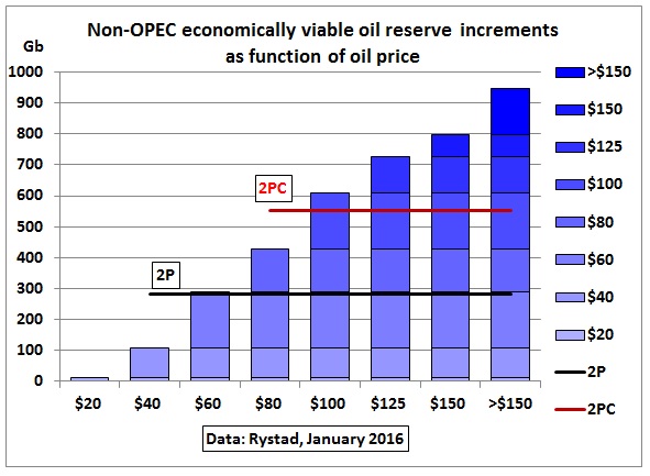
Fig 13: Non-OPEC: additional oil reserves as function of oil price
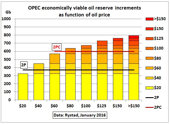
Fig 14: OPEC: additional oil reserves as function of oil price
The above graphs show which incremental amounts of oil reserves could be added from each oil price bracket. The Non-OPEC additions would be higher than those from OPEC for the same oil price increase.
Problems in Rystad’s data:
Apart from the issue whether oil reserves (Fig 6) are correct the main problem are oil prices for OPEC countries which are obviously NOT the fiscal break even oil prices. The following table shows the latest IMF numbers from April 2016:
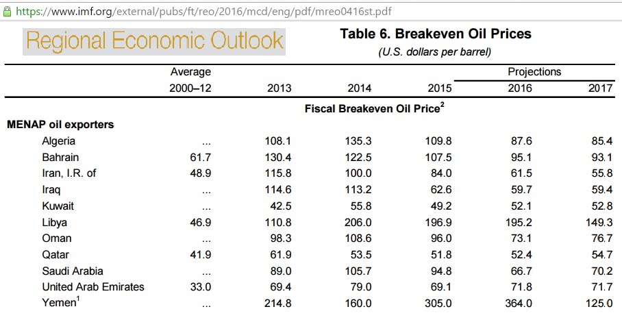
Fig 14: MENAP breakeven oil prices April 2016
https://www.imf.org/external/pubs/ft/reo/2016/mcd/eng/pdf/mreo0416st.pdf
So in the case of OPEC it seems Rystad took costs of production.
IEA’s oil price scenarios
If the reader is eager to know how much it will cost to get at those fantastic oil resources of Fig 5, then this graph will answer all questions:
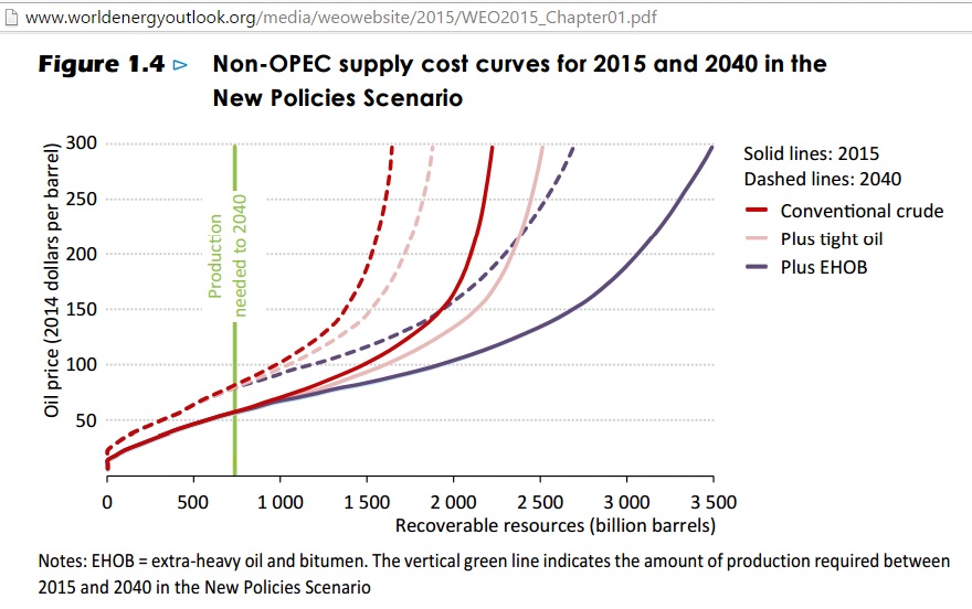
Fig 15: WEO 2015 cost curves for resources
Let’s zoom into the period until 2040:
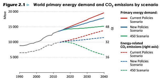
Fig 15: WEO 2015 oil price scenarios
IEA’s oil production and oil price scenarios vary greatly. They basically say that no one can predict future oil prices – which makes infrastructure planning a very risky task . But look at the 450 ppm scenario. It is not in line with the above quoted statement on the carbon budget. To analyse this issue is topic for another post.
The mean thing
An article on oil reserves would be incomplete without referring to the technical reserves of the French oil geologist Jean Laherrere. He is adding mean reserves (2P)
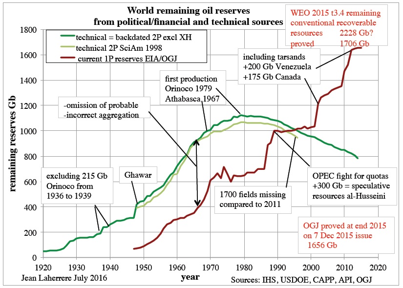
Fig 16: Laherrere’s 2P reserves
French oil geologist Jean Laherrere compares IEA’s political reserves (red line) with his technical estimate (green line) which peaked around 1980 and has dropped to below 800 Gb (excluding extra heavy oil). Jean’s 2P reserves are less than half of what is claimed to be proven in the BP Statistical Review. But it is higher than Rystad’s 655 Gb. This would need to be resolved. In all likelihood there are differences in statistically adding up 2P reserves.
Summary
“Proved” oil reserves in the BP Statistical Review are mixed with resources which may never be produced either because they are too expensive or nasty climate change events will physically force us to leave them in the ground.
No one can predict future oil prices which will determine future oil flows. This article graphically presented one methodology to show estimated amounts of oil available at certain oil price levels. If oil prices remain low much less oil will be produced than what the public is made to believe. That would be good for the climate. Provided of course the oil industry and OPEC countries can financially and socio-economically survive these lower oil prices. There are analysts like Gail Tverberg who predict a collapse of the system due to debt levels and insufficient growth of salaries.
Oil price spikes are sure to come which may push the oil market from one extreme to another. There is no statistical evidence that oil prices in the past stayed for very long at an intermediate level of, say, $70. So the situation is kind of instable. It follows that no new oil dependent infrastructure should be planned, financed and started because that would require reliable and affordable oil supplies for many decades to come.