Immigrants to blame for high house prices, businessman Dick Smith claims
Mr Smith said “jumbo loads” of immigrants arriving each week were the “main driver” behind the country’s housing affordability crisis
21/2/2017
http://www.smh.com.au/federal-politics/political-news/immigrants-to-blame-for-high-house-prices-businessman-dick-smith-claims-20170221-gui72k.html

Fig 1: Dick Smith: “But the most fundamental right is to own a house with a backyard – young couples can’t do that anymore”
https://www.youtube.com/watch?v=UllbsHYyVyI
Might we add, the higher cumulative immigration, the longer the petrol lines at the filling stations when the next oil crisis arrives.
Dick Smith’s campaign on population growth is well known. His website is here: http://dicksmithpopulation.com/
In December 2016 he warned on Channel 10: “…immigration should be around 70 K a year…it’s impossible to have more and more people forever…let’s keep Australia at 26 million….we can’t have perpetual growth”
https://www.youtube.com/watch?v=KsZIYY0jiZE
And former Prime Minister Tony Abbott has now entered the debate: “we’ll cut immigration to make housing more affordable”
24/7/2017
http://www.smh.com.au/federal-politics/political-news/tony-abbotts-fivepoint-plan-for-the-winnable-next-election-will-infuriate-malcolm-turnbull-20170223-gujkft.html
As this is a direct challenge to the current Prime Minister Turnbull the immigration politics are not going to be rational.
Australia’s population clock is here: http://www.abs.gov.au/ausstats/abs@.nsf/0/1647509ef7e25faaca2568a900154b63?OpenDocument
In this post, we look at the statistics and population scenarios for Sydney and NSW.
Times are changing. Usually, population growth is presented as a given so that the public accepts all the problems now very apparent in Sydney: worsening traffic congestion, pollution, unaffordable housing, overcrowding in schools and hospitals.
A month ago, the SMH wrote:
21 Jan 2017
“WestConnex [road tunnel], light rail, the Bays precinct, Green Square, Badgerys Creek [airport], a population that is expected to push past 5.5 million over the next decade, and a city that is rapidly building infrastructure to keep up with it.”
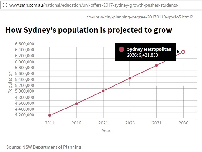
Fig 2: SMH copies NSW government’s “Main series” scenario
The numbers are from the NSW government’s population website http://www.planning.nsw.gov.au/projections
Under the “Scenarios” tab, the above website shows this graph:
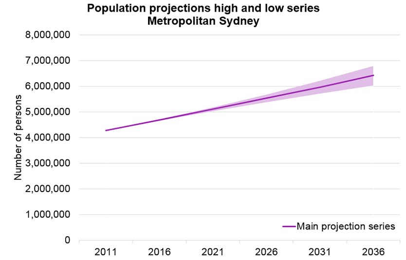
Fig 3: Graph shown on NSW population website for projection series
The projection range in Fig 3 merely reflects different assumptions for birth and death rates, but not immigration scenarios. These are hidden in an XLS table (scenario data tab):
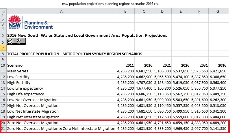
Fig 4: NSW government population scenarios
The difference between zero net overseas migration (4.889 million) and the main series (6.421 million) is fundamental, 1.5 million. This would be a new capital on its own. Or almost 4 Canberras, if you like.
The scenarios have following settings and parameters:
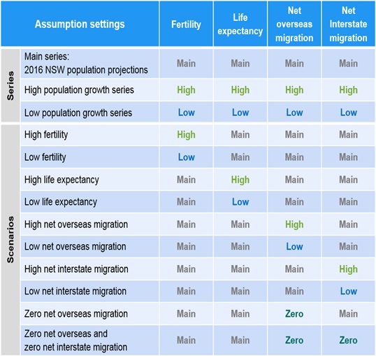
Fig 5: Settings for NSW population scenarios
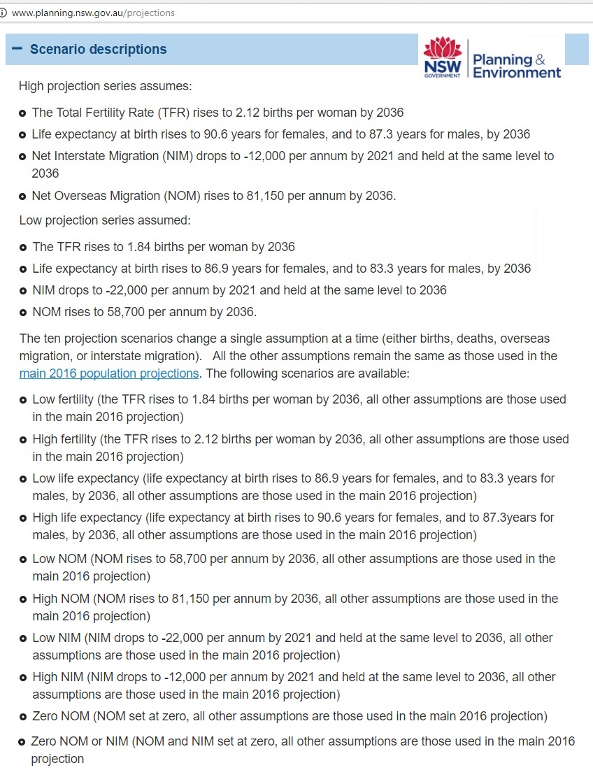
Fig 6: Parameters for population scenarios in NSW
NOM to NSW during the 2011-2016 period was 64,940 pa or 1,250 per week (yes, three and a half 747-400s)
A high fertility rate is unlikely as most of the additional population is planned to be housed in flats. This has not been considered in a NSW document (2014) on births: http://www.planning.nsw.gov.au/~/media/D14B7647C2B0474BAE7B72046219632A.ashx
Note the difference between “series” and “scenarios”. We put the zero overseas migration scenarios (line 20 and 21 in Fig 4) into a graph:
Fig 7: Selected scenarios from Fig 2
We find that natural population growth 2016-2036 without net interstate migration and zero NOM would be 5.14 – 4.68 = 460 K. However, Sydney siders are leaving the city in droves, so the resulting population would only be 4.89 million, an increase of 210 K. Even that in itself could be a new city outside the commuting distance of Sydney
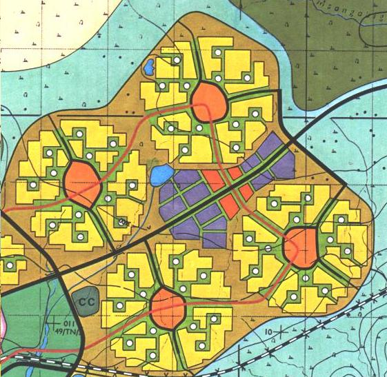
Fig 8: Model of a city with 4 x 35 = 140 K population
This would be an energy frugal city mainly with terrace housing, community based commercial centres and one common city centre. Due to short distances transport infrastructure requirements are low, a genuine half hour city.
A Pentagon shape could increase this to 175 K. Or larger communities (either more land or higher densities) could bring this to 200 K. A locational analysis for such a city would be an interesting task. Deputy Prime Minister Barnaby Joyce recently invited fed-up Sydneysiders to move to Armidale where the railway clock stopped at midnight.
Now let’s look at NSW as a State. On the NSW population website we find this graph:
Fig 9: NSW population projections (projections tab)
With this note: “Projections can change due to factors such as migration levels, new technology and social attitudes to different living arrangements.”
Just as in the case with Sydney, the zero NOM scenarios are buried in an XLS file:
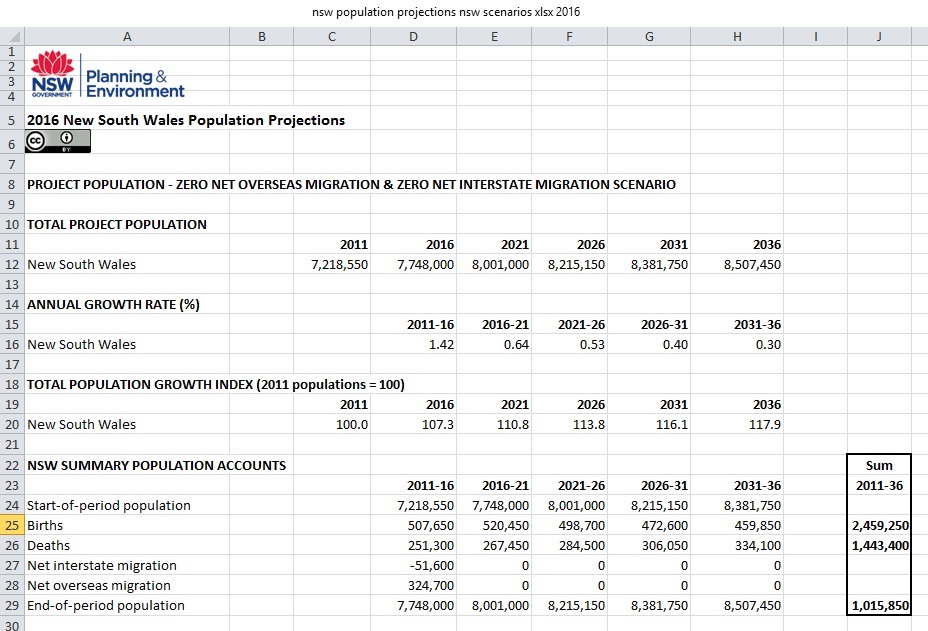
Fig 10: NSW zero NIM and zero NOM projection (sum box added by author)
The total natural population growth 2011-2036 is 1 million (out of which 855 K in Sydney) but not 1.34 million as in Fig 9, which apparently includes natural increase from immigrants of 340 K. This should be shown separately. Apparently the government is interested to show as much growth as possible without considering immigration scenarios.
To blur the issue even further the website states:
“These projections are not targets. Projections are based on assumptions that take into account trends for births, deaths and migration.
Projections can change due to factors such as migration levels, new technology and social attitudes to different living arrangements.”
http://www.planning.nsw.gov.au/projections
Of course the projections for overseas migration are targets which are controlled by the Federal Government. Their “Corporate Plan 2016/17” (not departmental plan, by the way!) mentions the word “target” in these tables:
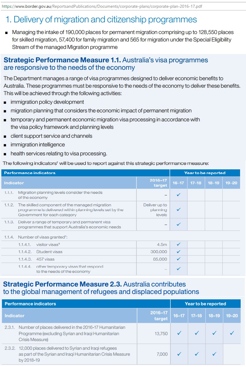
Fig 11: Federal government’s immigration targets (excerpts)
And the following graph shows how federal targets have been met:
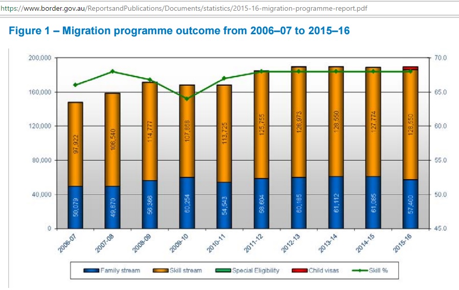
Fig 12: Family and skill streams for permanent resident visas
https://www.border.gov.au/ReportsandPublications/Documents/statistics/2015-16-migration-programme-report.pdf
NSW has a share of around 33%. So we have 190 K x 0.33 x 20 years = 1.25 million additional permanent residents plus their natural growth.
It is argued that immigration improves the population pyramid which is strongly dependent on fertility rates. These have been in decline since 1962 and especially after 1972. They are now below replacement level (which is 2.1).
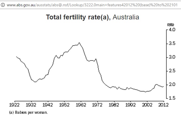
Fig 13: Fertility rates in Australia
http://www.abs.gov.au/ausstats/abs@.nsf/Lookup/3222.0main+features42012%20(base)%20to%202101
The 2015 fertility rate was 1.8 http://www.abs.gov.au/ausstats/abs@.nsf/mf/3301.0
Let’s have a look at how these fertility rates shaped the population pyramid:
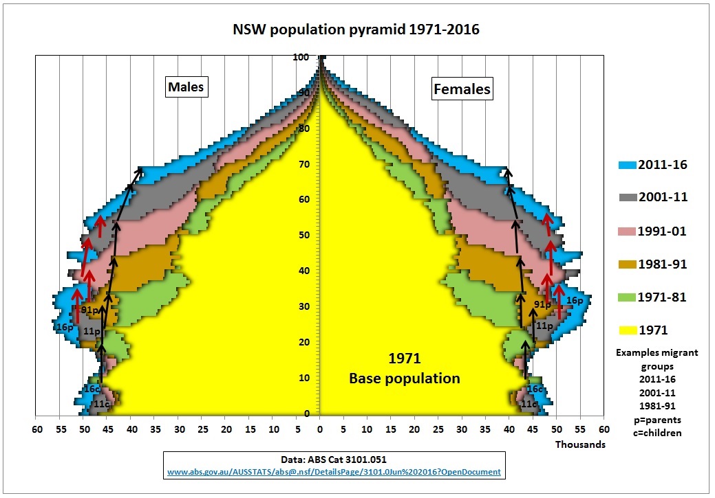
Fig 14: Australia’s immigration bulge (arrows, migrant groups are indicative only)
Data from table 51 in Australian Demographic Statistics, Jun 2016
http://www.abs.gov.au/AUSSTATS/abs@.nsf/DetailsPage/3101.0Jun%202016?OpenDocument
This graph has been designed by superimposing decadal population pyramids. The 1971 population pyramid (yellow) has dents from lower fertilities during the great depression of the 1920s and 1930s and the WW2 years. We then have the baby boom years and another dent when fertility dropped from its peak of 3.5 (introduction of the pill). All in all, this 1971 pyramid had a growing population with a fertility of 3.
But then fertility dropped to around 2. Over the long term, this means a stationary population with each age group of approximately the same size, thinning at the top. In the above graph black arrows show the outline of this natural population change as age groups move up the pyramid. The population bounded by these arrows is around 7 million. Everything outside is the immigration bulge (red arrows).
Examples of migration groups are 1981-91 (91 p), 2001-2011 (11p with children 11c) and the latest, large group 2011-2016 (16p with children 16c). Note that this group has even 45 and 55-65 year old migrants. Maybe this is the business visa class and parents from the 20-35 year group.
Migrants are fed sideways into the population pyramid with following age structure:
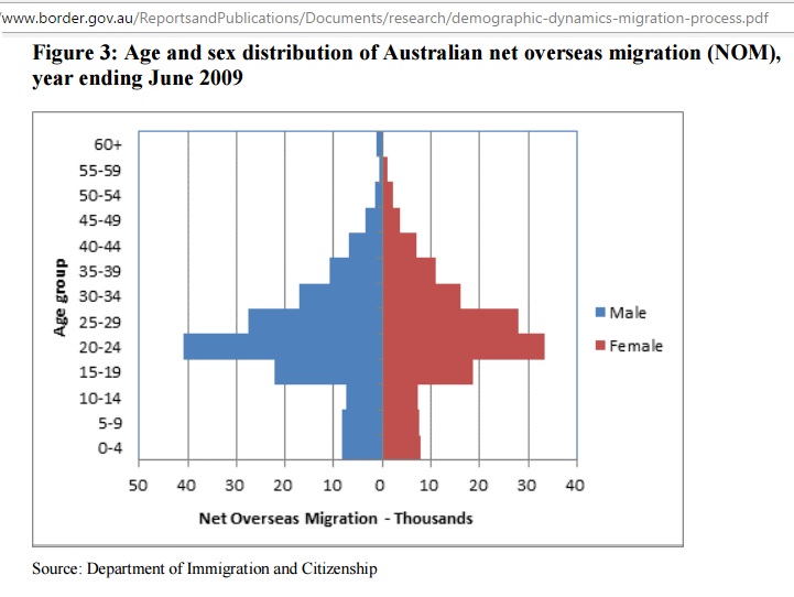
Fig 15: NOM age and sex distribution
https://www.border.gov.au/ReportsandPublications/Documents/research/demographic-dynamics-migration-process.pdf
In Fig 14 we see that the impact of adding a comparatively small number of children (from Fig 15 plus children born by migrants) to the bottom of the population pyramid is a huge immigration bulge further up the pyramid, making the population structure top heavy.
In other words: no immigration program can substitute adequate fertility rates no matter what the population target is.
A 2001 factsheet of the Department of Family and Community Services summarizes:
“Immigration is able to ameliorate but not reverse this situation [of low fertility rates]. This is principally because immigrants also age, and, at numbers above 100,000 they do little to influence the age structure of the population while having a significant impact on total population.”
https://www.dss.gov.au/sites/default/files/documents/05_2012/facssheet9.pdf
In a 2011 working paper “The demographic dynamics of migration processes” for the Department of Immigration and Citizenship we find following statement:
“The message from this is that a population with below replacement fertility that wished to move to a stationary situation with the lowest possible total population would do so by increasing its fertility as soon as possible to the replacement level and having zero net migration”
https://www.border.gov.au/ReportsandPublications/Documents/research/demographic-dynamics-migration-process.pdf
Therefore, it makes little sense to grow the population with immigration at all costs. Immigration should be limited to compensate for low fertility rates, to aim for a stationary population. Isn’t there a clever way to grow the economy without population growth?
Immigration is now so high that most new comers are housed in expensive flats, an environment hostile for children, contributing to lower fertility rates and requiring more immigration. A vicious cycle.
Fig 16: Parramatta’s residential towers good for children and seniors?
By the way, without mandatory energy efficiencies current plans mean that peak power demand in Parramatta will increase from 60 MW to 225 MW (Fig 20).
Conclusion:
Governments don’t like a public debate about immigration because they think population growth is the only way to grow GDP – especially after the mining investment boom is over. However, the problem of housing affordability has now made the public aware that current policies cannot continue. A Sydney population of 6.42 million would be a nightmare, given how unsustainable this city is already now. Sydney’s population growth could be limited to 200 K if immigration were cut immediately.
The next bottleneck for uncontrolled immigration will be power shortages in hot summers as just experienced. Gas shortages on the East coast are also looming because Australia’s gas is squandered in LNG exports. And then there are the 2 Damocles swords hanging over Australia’s long supply lines of oil and fuel imports: unforeseeable events in the Middle East and now also in the South China Sea. Moreover, China’s oil production has peaked. That will change history. A reduction of overseas migration to a minimum would be imperative to limit Australia’s oil vulnerability and to keep the lights on.
Further reading:
Animated age structure 1971-2061
http://www.abs.gov.au/websitedbs/d3310114.nsf/home/Population%20Pyramid%20-%20Australia
Migrant Intake into Australia
Australian Productivity Commission
Inquiry Report Sep 2016
http://www.pc.gov.au/inquiries/completed/migrant-intake/report