Summary:
Oil reserves as reported in the Statistical Review have experienced a phenomenal growth but are not all proven (1P) reserves as claimed. The reserve tables provided contain a mixture of resources (maybe even discoveries), proved, probable and possible reserves. Tar and extra heavy oil are now also included although these have completely different production profiles. 41% of the global oil production has declined since 2002 at 0.9% pa, a trend which seems to be irreversible. It is also noteworthy that these 41% of oil come from a very small reserve/resource base of just 184 Gb which – without massive new investments in reserve replacement – would be depleted in only 15 years. The former Soviet Union has a better reserve to production ratio of 25 years. This means it makes no sense to build new oil dependent infrastructure with a project life of several decades.
(1) BP oil reserve history
You think that the world sits on 1652.6 Gb of proved (P1) oil reserves as claimed in the BP Statistical Review?
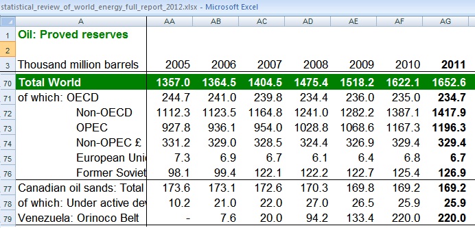 http://www.bp.com/sectionbodycopy.do?categoryId=7500&contentId=7068481
Think again. What the BP Statistical Review reports is a Hodge-podge of tar, bitumen, extra heavy oil, heavy oil, speculative resources, discoveries, possible, probable and finally – a fraction of the lot – proved oil reserves. This article tries to shed some light on what is added to what.
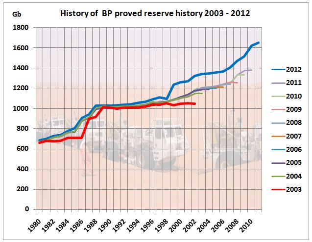 In each year in June, BP publishes the Statistical Review with a work sheet named “Oil – proved reserves history”. This graph shows the world’s reserves, from the reports 2003 to 2012. Each report refers to data available up to the end of the previous calendar year. Note these should be proved reserves, P1. They have increased by a whopping 60%.
We start with the 2003 report (red line), published a month after George Bush declared “mission accomplished”. In that year, stacked reserves looked like this:
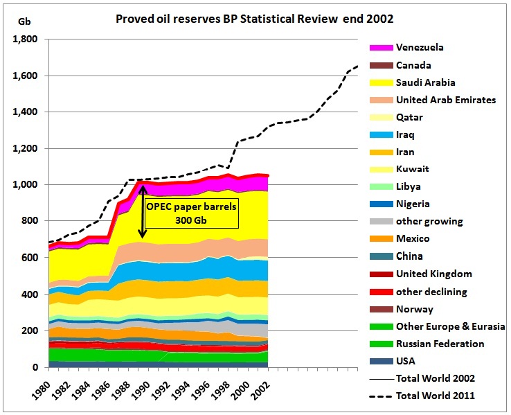 The jump in reserves in the late 80s are OPEC’s spurious reserve additions as described in ASPO’s Newsletter 39 (March 2004)
http://aspoireland.files.wordpress.com/2009/12/newsletter39_200403.pdf
and as confirmed by ex Saudi Aramco chief Saddad-al-Husseini in his Oct 2007 presentation to the Energy Intelligence “Oil & Money” conference in London.
http://crudeoilpeak.info/opec-paper-barrels
The BP 2003 fine-print says:
Source of data: With the exception of Azerbaijan, Kazakhstan and Egypt (for 2001), the estimates contained in this table are those published by the Oil & Gas Journal, plus an estimate of natural gas liquids for USA and Canada. Reserves of shale oil and oil sands are not included.
Of course, the flat red line is not good news so in 2004, BP’s definition of oil is substantially changed:
Source of data: The estimates in this table have been compiled using a combination of primary official sources, third party data from the OPEC and an independent estimate of Russian reserves based on information in the public domain. The reserves figures shown do not necessarily meet the United States Securities and Exchange Commission definitions and guidelines for determining proved reserves nor necessarily represent BP’s view of proved reserves by country. The figure for Canadian oil reserves includes an official estimate of Canadian oil sands “under active development”. Oil includes gas condensate and natural gas liquids as well as crude oil.
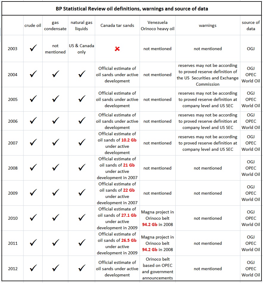
This table gives an overview for the whole report set 2003-2012:
 So let’s have a look how this 60% increase has come about
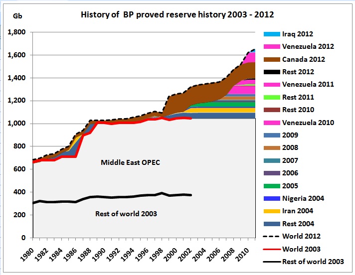 How the oil reserve history has evolved. We start with the 2003 report (red line) and see how much was added and changed up to the 2012 report. 64% of reserve additions are from tar sands or extra heavy oil. Another 20% are from MENA countries, all with their own geo-political problems. Here are the numbers:
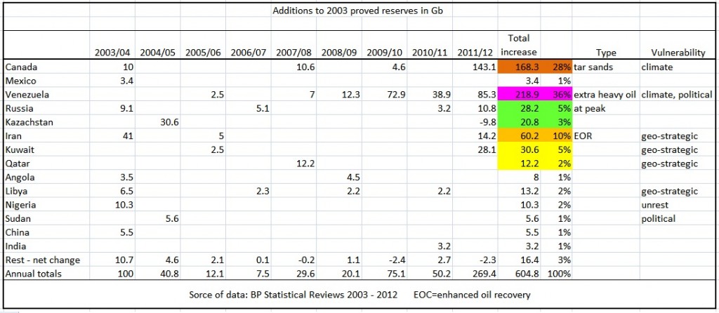 Let’s have a look at the 2 main items in the above table:
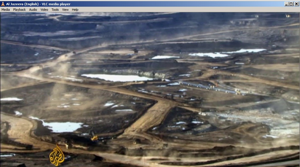
(2) Canadian tar sands
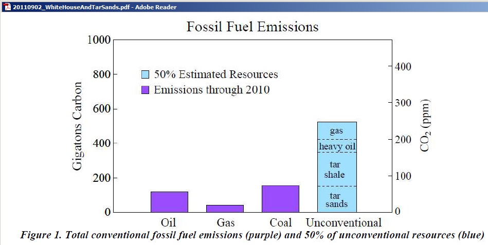
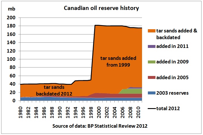 That is an environmental and climate disaster as syncrude from tar sands adds more CO2 to the atmosphere as calculated by NASA climatologist James Hansen:
http://www.columbia.edu/~jeh1/mailings/2011/20110902_WhiteHouseAndTarSands.pdf
(3) Extra heavy oil in Venezuela
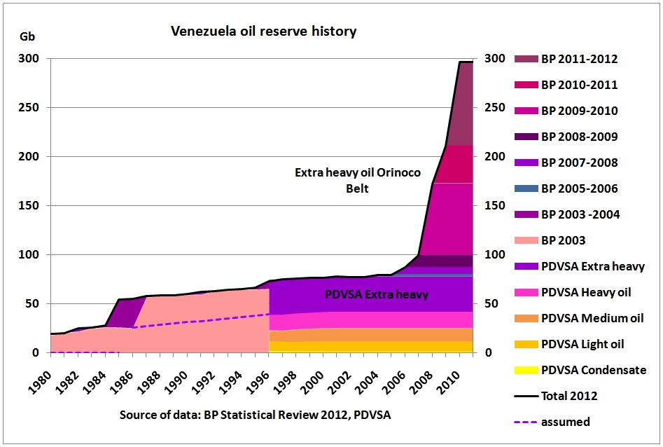
In this graph, BP 2003 oil reserves have been replaced by PDVSA reserves after 1996. The BP report refers to 220 Gb of Orinoco oil. But the PDVSA annual report of 2011 shows that more than that is actually extra heavy:
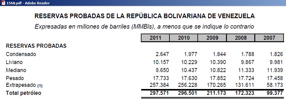
http://www.pdvsa.com/index.php?tpl=interface.sp/design/biblioteca/readdoc.tpl.html&newsid_obj_id=5319&newsid_temas=111
So we see that according to PDVSA official data, there is only around 40 Gb of oil which is not extra heavy and of that only about half is light to medium oil. And whether these are remaining reserves is another question altogether.
It is comparatively easy to add extra heavy oil “reserves” in a chart. But not so easy to produce.
 Comandante Hugo Chavez demonstrating what extra heavy oil means
(4) All together now:
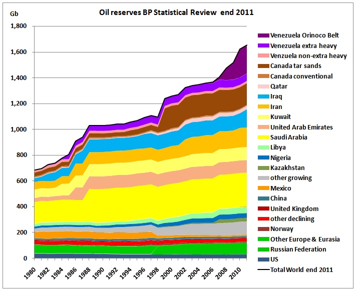 (5) Comparison reserves/production
There can be a lot of oil in reserve books but what really matters are physical oil flows coming from these reserves.
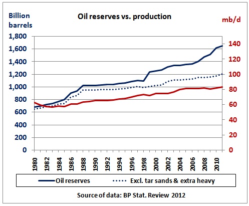 We can clearly see that production did not increase commensurate with the history of reserves. Production neither followed the increase of OPEC reserves in the end 80s (after the economy recovered from the 2nd oil crisis) nor the jump in non-conventional tar sands and extra heavy oil.
(6) The disconnect between reserves and production
That brings us to an update of an article Gail the Actuary in the Oildrum wrote in March 2008 using my research at the time. http://www.theoildrum.com/node/3664/
This is the updated graph:
 On the left hand side we see the mixed bag of 1P, 2P and 3P reserves, unaudited OPEC reserves, speculative OPEC resources, tar sands and extra heavy oil all of which produce annual oil flows which are not commensurate with the size of their underlying reserve/resources basis. Most striking is the fact that 41% of oil production comes from just 11% of claimed reserves and that 37% of production declined by 2.5 mb/d after its peak in 2002. This table gives more details:
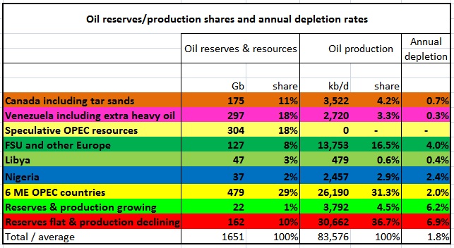 Note the very high annual depletion rate of 6.8% for 41% of the world’s oil production. Alarming is also that the Former Soviet Union including Azerbaijan and Kazachstan produces at depletion rates double that of OPEC ME countries and on a much smaller reserve base.
The following 2 graphs show details of the bright red and green areas above:
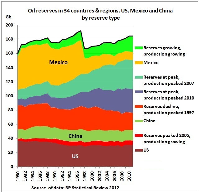 The sudden drop in Mexican reserves in 1998 is due to the introduction of SEC proved reserve definitions as described in this document on page 2:
http://www.pemex.com/files/content/ACFKPF5DbyYJ.pdf
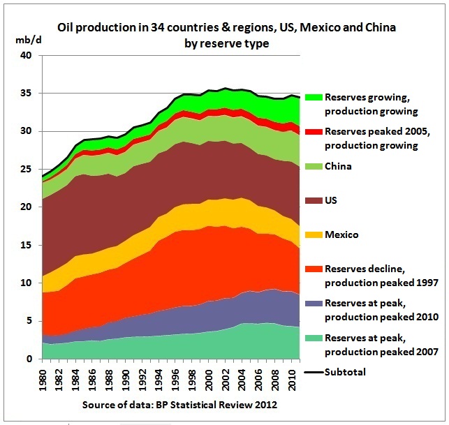 This graph shows that 30.6 mb/d of production are in long term decline (at -0.9 % pa) since their peak in 2002. This decline was partially offset by a small group of 5 growing countries. The total group shown in the graph (41% of global production) dropped by 1.2 mb/d.
(7) Russia and Saudi Arabia
Saudi Arabia and Russia are the 2 largest oil producers.
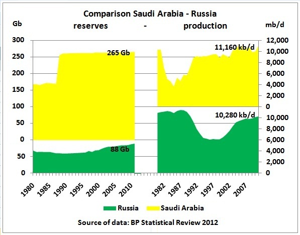 Russia’s depletion rate is 10,280 kb/d / 88 Gb = 4.2 % pa equivalent to a reserve to production ratio of 23.4 years. On the graph, we see Russia’s 2nd and last oil production peak shaping up. The 1st oil peak contributed to the down-fall of the Soviet Union as exports to Eastern Europe could not grow, leading to economic stagnation, discontent in the population and ultimately to the fall of the Berlin wall.
Using official reserves, Saudi Arabia produces at a very low 11,160 kb/d / 265 Gb = 1.5 %. What the real reserves are is anyone’s guess but if it were 130 Gb
http://www.peakoil.net/press-releases/aspo-and-peak-oil-theorists-challenge-saudi-arabia
the Saudi depletion rate would be around 3% pa. In any case, Russia’s depletion rate seems to be higher than Saudi Arabia’s.
(8) Australian reserve reporting by BP Statistical Review
If you think confusing, if not incorrect, reserve reporting is limited to OPEC and other exotic places, you make a big mistake. Australia, for example, is in it, too. This was covered in a previous post
25/7/2012
BP Statistical Review 2012: Australia’s proved oil reserves overreported by a factor of 2
http://crudeoilpeak.info/bp-statistical-review-2012-part-2-australia-proved-oil-reserves-overreported-by-a-factor-of-2
(9) Technical vs political oil reserves
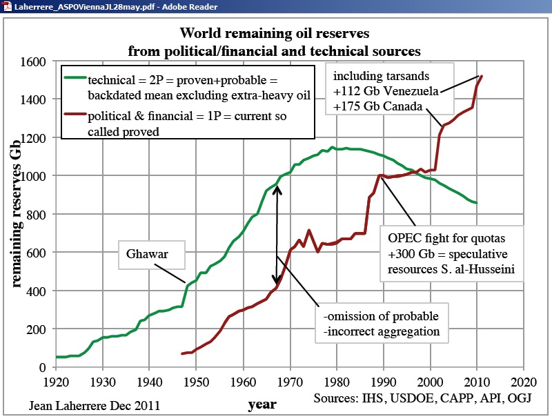
Jean Laherrere from ASPO France calls BP reserves “political reserves”.
http://aspofrance.viabloga.com/texts/documents
 http://aspofrance.viabloga.com/files/JL_ASPOVienna28may2012.pdf
According to this graph global technical 2P reserves excluding heavy oil and tar sands are around 800 Gb
Conclusion:
Several years ago, when warning the NSW government not to build any new oil dependent infrastructure, the Planning Minister replied that he did not see any problem because oil reserves were increasing. In the not too distant future it will be seen that growing reserves in confusing statistics can be very deceiving. Then it will be too late.
