Using JODI data, crude oil exports have peaked in 2005/2006 and since then have shrunk by a total of 5% despite export growth in several countries including Iraq and Canada (unconventional oil from tar sands). On the other side of the export/import equation, growing crude imports by China and India have come and will need to continue to come from savings elsewhere, mainly OECD countries, including the US.
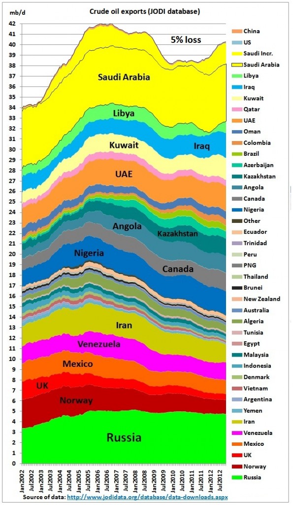 What you see is what you get: the world lost around 5% of global crude oil exports since the peak in 2006 (12-month moving average). Use your magnifying glass to look for crude exports from the US, allegedly to become the leader of an “energy” export revolution.
This post uses JODI data (Joint Oil Data Initiative established by the International Energy Forum – APEC, Eurostat, IEA, OLADE, OPEC and UNSD) up to November 2012
http://www.jodidata.org/database/data-downloads.aspx
Crude oil export profiles (12 month running average) are stacked in following order
(1) The Russian export plateau is clearly visible, at around 4.8 mb/d
(2) The declining group (including Iran) which peaked in 2005 at 14.5 mb/d is now down by 5.1 mb/d to 9.4 mb/d
(3) The growing group increasing exports from around 4 mb/d to 7.5 mb/d – but that growth seems to level off
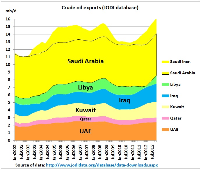
(4) OPEC Gulf (excluding Iran) plus Libya
This group shows a recovery after the oil war in Libya but exports increased by just 1 mb/d compared to 2005/06. Saudi Arabia delivered a minimum of 5.5 mb/d. (yellow area with black border) over the whole period but increments on top of this were not higher in 2012 than 7 years ago.
Let’s have a look at some typical crude export profiles
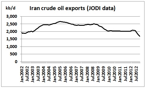
Iran’s 2nd and last oil peak – with yet incalculable geopolitical consequences
UK decline
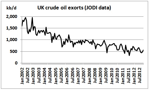 Monthly data showing seasonal variations
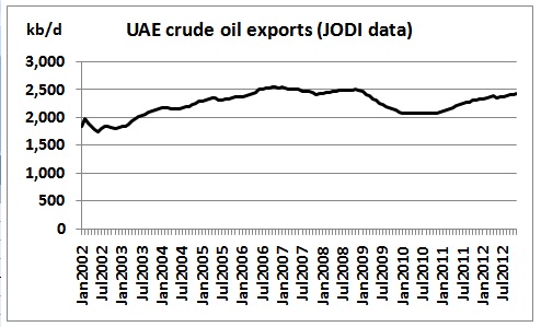
UAE undulating plateau
Iraq growth
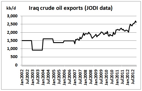 Monthly data showing impact of war
Canada growth
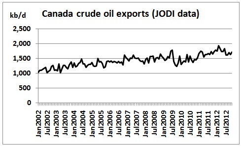 Growth from tar-sands – 1 mb/d at best – at huge environmental cost and increasing CO2 emissions. It can’t offset decline of conventional oil.
Crude oil imports
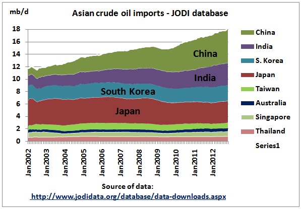
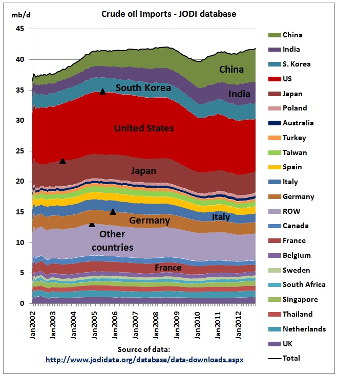 Crude oil import profiles are stacked in the order flat – declining – growing. We see a zero sum game in which Chindia snatches oil away from OECD countries and the rest of the world (ROW)
US imports
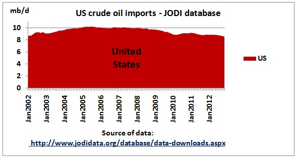 US crude oil imports peaked at 10.3 mb/d in July 2005. Since Jan 2010 US crude oil production increased by 1.3 mb/d but crude imports declined by only 0.4 mb/d which means that 70% of the shale oil boom is consumed domestically. To this extent, pressures on global oil markets are not reduced. So the numbers do not confirm what the media are reporting.
Asia imports
Comparison exports – imports
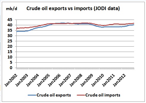 One would expect that exports equal imports over a longer period but data show that imports are higher. EIA data show the same differences (data only available until 2010 at present):
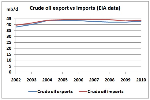 http://www.eia.gov/cfapps/ipdbproject/iedindex3.cfm?tid=5&pid=57&aid=3&cid=ww,&syid=2002&eyid=2010&unit=TBPD
If anything, higher imports would reflect the enormous pressure exports are under.
Conclusion
While the propaganda machine of the oil industry to debunk peak oil is in full swing – and the media playing an active part in it – crude oil exports, one of the most important metrics on global oil markets, have already peaked. Even if a recent rebound in exports should continue the best case scenario is a zero sum game between Chindia and the rest of the world. As China is manufacturing 18 million cars EVERY YEAR – with the help of Australian iron ore and coking coal – one can wish 12.7 million Australian motorists, 2.6 million LCV drivers and 0.5 million truckies only good luck in participating in this game. The best case scenario here is that pollution in Chinese cities gets so bad that all these new cars never hit the road.
 Beijing tollway closed due to smog Jan 2013
Appendix on JODI data adjustments
The JODI database contains some missing data. Following adjustments have been made to the original data set:
(a) missing months have been calculated as the average of the nearest months available
(b) for longer missing periods until 2010, EIA data have been used
(c) for missing periods in 2011 and 2012 the latest JODI data in 2010 have been assumed to continue
(d) In 2002, the first year of JODI data, moving averages have been calculated on periods less than 12 months. For the 1st quarter of 2002, data have been adjusted to arrive at smooth curves consistent with trends.
(e) some decimal points were corrected.
It is unlikely that any other method of filling in missing data would lead to different graphs and conclusions.
