The IEA (in Paris) proudly announced in its latest September 2018 Monthly Oil Market Report that global supplies (of liquids) have reached 100 mb/d in August, an impressive figure. What matters, however, is crude oil production, something the IEA does not show in its monthly reports (only OPEC’s crude oil production is given). We therefore look at data of the US Energy Information Administration EIA which go up to May 2018 at the time of writing this article.
As shown in Fig 1, it is clear that the world’s crude production had a distinctive kink in 2005 which looked like a peak at the time of the financial crisis 2008/09. So what has happened since then? How successful was money printing to rescue the oil production system?
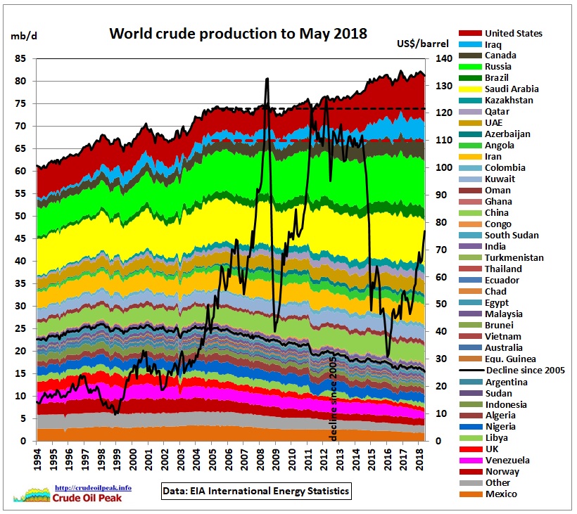 Fig 1: World crude production and Brent oil price
In Fig 1, countries are stacked in the order given in Fig 2 where on the left we have countries which have declined since 2005 (red columns group A) and on the right we have countries which increased production after 2005 (green columns group B)
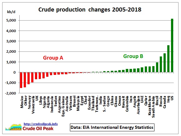 Fig 2: Crude production changes between 2005 and 2018 by country
Group A
Countries where average oil production Jan-May 2018 was lower than the average in 2005. At the bottom is Mexico with the highest rate of decline. This group started to peak in 1997, entering a long bumpy production plateau at around 25 mb/d, ending – you guessed it – in 2005. This is down now to 16 mb/d, a decline of 700 kb/d pa (-2.8% pa).
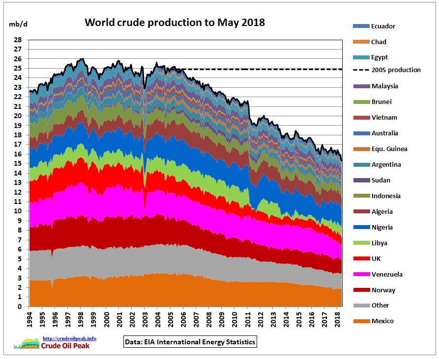 Fig 3: Group A countries
Group B
Countries where average oil production Jan-May 2018 was higher than the average in 2005. At the top of the stack are Iraq and the US, where growth was highest. Group B compensated for the decline in group A and provided for growth above the red dashed line in Fig 1.
The 2018 data have not been seasonally adjusted.
In group B we have a subgroup of countries which peaked after 2005
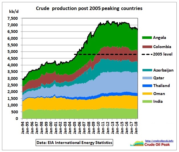 Fig 4: Countries peaking after 2005
A production plateau above 7 mb/d lasted for 6 years between 2010 and 2016. The average was 7.1 mb/d, around +1.8 mb/d higher than in 2005. Another country in this subgroup is China, here shown separately because of its importance and consequences.
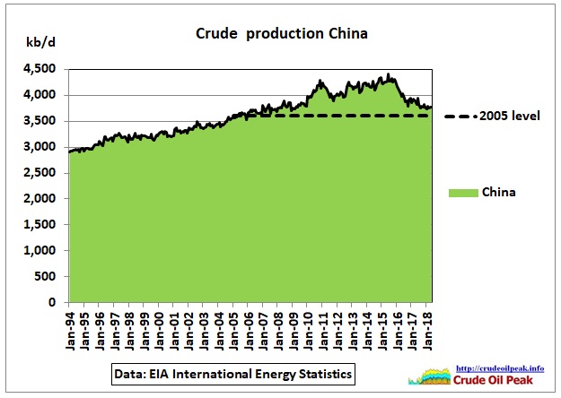 Fig 5: China’s crude production peaked in June 2015
In the first 5 months of 2018, China’s crude production was just 150 kb/d higher than in 2005. So China will soon slide down into group A.
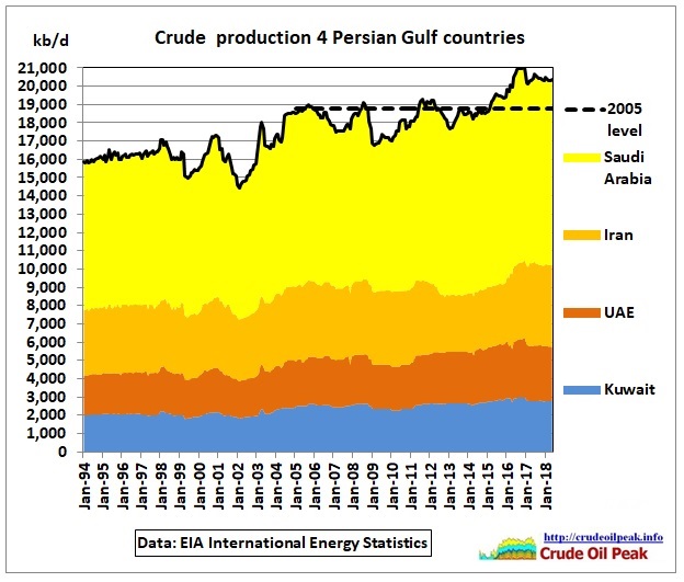 Fig 6: Crude production from 4 Persian Gulf countries
The dashed line is the 2005 production level of 18.8 mb/d. Saudi decline between 2005 and 2007 contributed to high oil prices in 2007, causing the US recession. Production in 2018 so far was just 1.6 mb/d higher than in 2005.
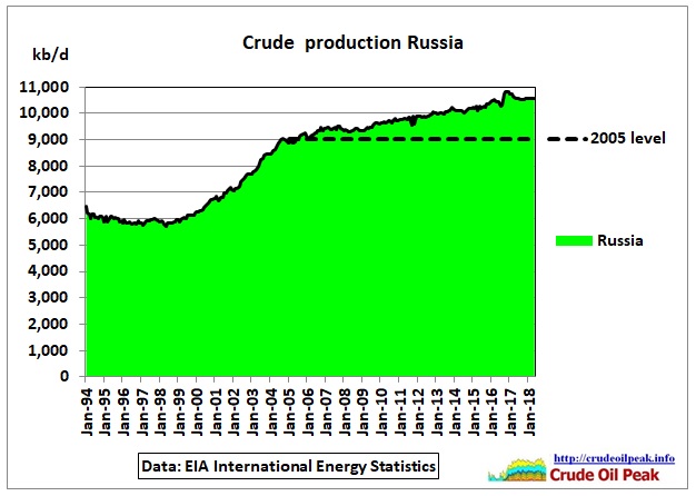 Fig 7: Russia crude production in 2018 was 1.5 mb/d higher than in 2005
Note the 2005 kink in the production curve.
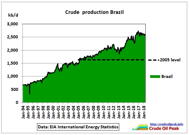 Fig 8: In Brazil 2018 production was around 1 mb/d higher than in 2005
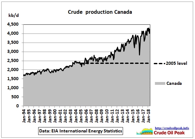 Fig 9: In Canada 2018 production was around 1.8 mb/d higher than in 2005
We see a big disruption of tar sand production during the Fort McMurray wildfire in 2016.
NASA climatologist James Hansen notes that tar sands will make the global warming problem unsolvable:
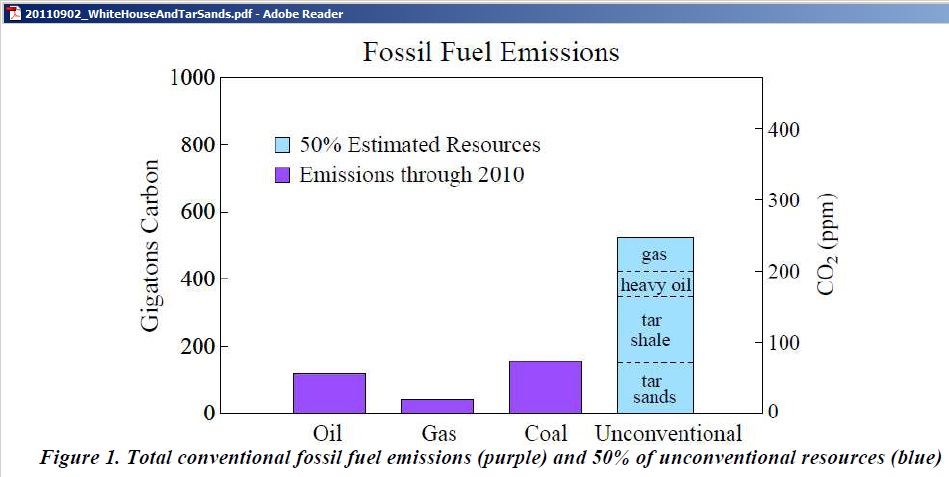 Fig 10: 50% of tar sand resources will emit as much CO2 as coal produced until 2010
http://www.columbia.edu/~jeh1/mailings/2011/20110902_WhiteHouseAndTarSands.pdf
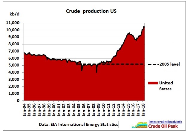 Fig 11: the US shale oil boom started in 2010/11 (+5.2 mb/d)
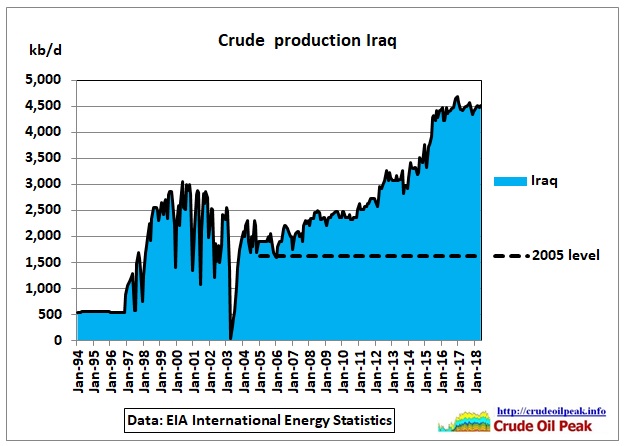 Fig 12: It took almost 10 years after the 2003 war to get back to pre-war levels
Iraq was and is the only country in the Middle East which under-produced oil. First, in the Iran-Iraq war and later due to sanctions imposed on Saddam. So an increase in production was expected after the Iraq war. But it took longer than planned
Oil price outlook
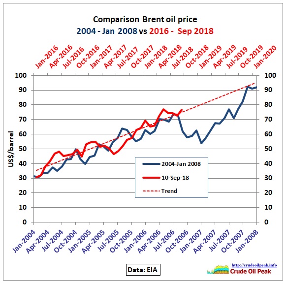 Fig 13: Comparison between 2004-2008 and 2016-2020
Summary
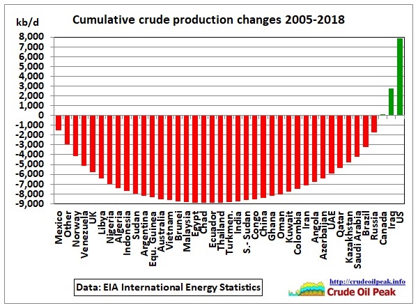 Fig 13: Cumulative crude production changes since 2005
This is a cumulative curve of Fig 2 with changes in ascending order (from negative to positive). On the left, declining production from group A adds up to -9 mb/d (column at Ecuador). Then moving to the right, countries with growing production reduce the cumulative (still negative) until the system is in balance (column at Canada). Only Iraq and the US provide for growth.
Conclusion:
Assuming that the balancing act between declining and growing countries continues (from Mexico through to Canada) the whole system will peak when the US shale oil peaks (in the Permian) as a result of geology or other factors and/or lack of finance in the next credit crunch and when Iraq peaks due to social unrest or other military confrontation in the oil producing Basra region. There are added risks from continuing disruptions in Nigeria and Libya, steeper declines in Venezuela and the impact of sanctions on Iran.
Related post:
An update can be found here:
10/6/2019
World crude production outside US and Iraq is flat since 2005
http://crudeoilpeak.info/world-crude-production-outside-us-and-iraq-is-flat-since-2005