The Australian Prime Minister claimed emissions are down 20% from 2005 levels
10 Aug 2021
Prime Minister: “…Australia is part of the solution. Our emissions have fallen by 20 per cent since 2005. We are the only country to our knowledge, that engages in the transparency of reporting our emissions reductions, every sector, every gas, every quarter”
The Hon. Angus Taylor MP, Minister for Energy and Emissions Reduction: “We’re seeing extraordinary changes in farming practices, in the deployment of soil testing technologies by farmers across this country bringing down emissions, contributing to Australia’s performance, whereby we met and beat our Kyoto targets, our 2020 targets, 459 million tonnes. We beat those targets, almost a year’s worth of emissions. We’re on track to meet and beat our 2030 targets as well.”
https://www.pm.gov.au/media/press-conference-canberra-act-14
2005 is of course the year in which the Kyoto protocol (adopted in December 1997) came into force https://unfccc.int/kyoto_protocol for which Australia negotiated an INCREASE of 108% on 1990 levels for the commitment period 2008-2012. Remember that PM Rudd ratified Kyoto in December 2007, shortly after coming to power.
So let’s have a look at the latest quarterly report (December 2020) current at the time of the above media release:
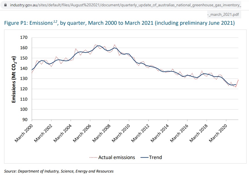 Fig 1: Australia’s emissions from the quarterly December 2020 report
https://www.industry.gov.au/data-and-publications/national-greenhouse-gas-inventory-quarterly-update-december-2020
An archive of all quarterly reports since March 2009 can be found here:
https://www.industry.gov.au/data-and-publications/national-greenhouse-gas-inventory-quarterly-updates
Note that the above graph is not zero scaled, so the decline looks impressive. The next graph with the same data gives the right perspective:
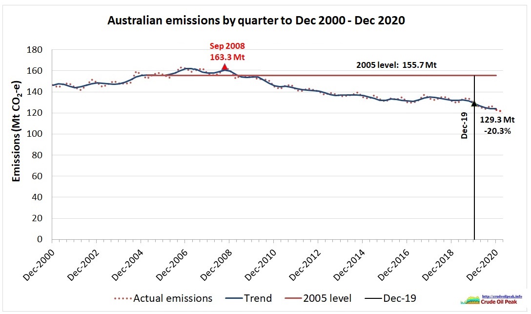 Fig 2: Quarterly emissions zero scaled with 2005 (trend) level
We use the data sources XLS file (Figure P1 sheet) and add the 2005 emissions level of 155.7 Mt (sum of quarterly emissions) as a horizontal red line which gives us a decrease of 20.3% by December 2019, the last month before Covid19 hit. The actual quarterly peak was in September 2008.
Let’s see how that peak came about. In order to show this we have to use the data contained in table 1A in the XLS file (p 44 in the PDF file), which starts in FY 2001/02.
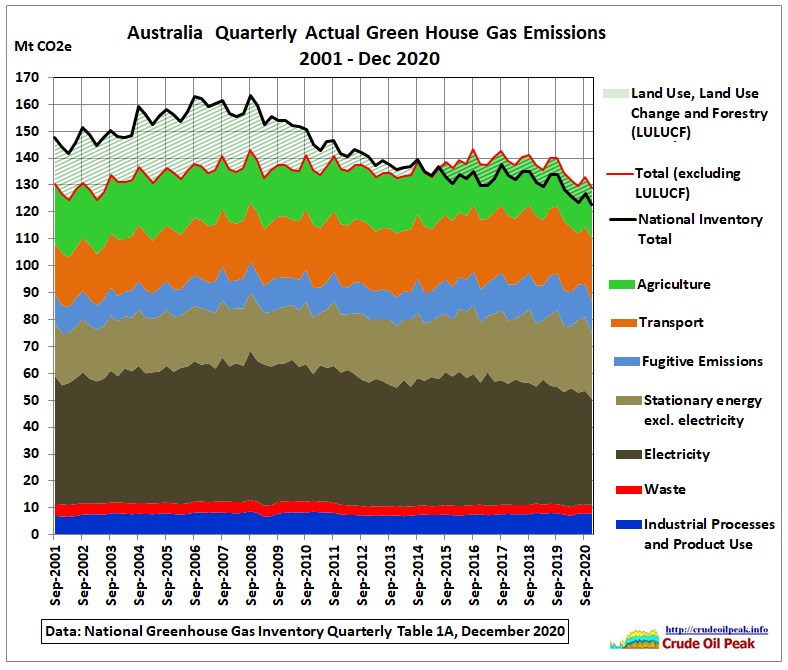 Fig 3: Quarterly GHG emissions
Prime Minister Abbott came to power in Sep 2013. In July 2014 the Carbon Tax Repeal Bill was passed in the Senate. Emissions from burning fossil fuels went up.
The peak from all emissions in the period Sep 2006 – Sep 2008 was created by an increase in emissions from land use, land use changes and forestry (LULUCF) which can vary from year to year.
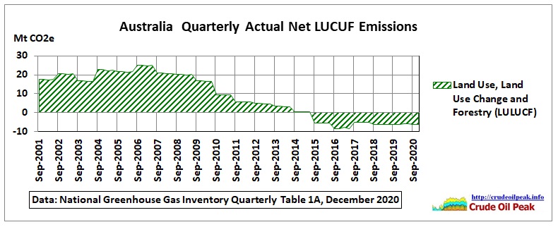 Fig 4: Net quarterly LUCUF emissions (from Table 1A)
Complicated GHG accountancy calculated a peak in 2006/07. A description of these emissions can be found in this March 2015 report “Australian Land Use, Land Use-Change and Forestry emissions projections to 2035”
https://www.industry.gov.au/sites/default/files/2020-07/lulucf-emissions-projections-2014-15.pdf
The quarterly December 2020 report shows the components of these LULUCF emissions in the following graph, but only on an annual basis (starting with 1990):
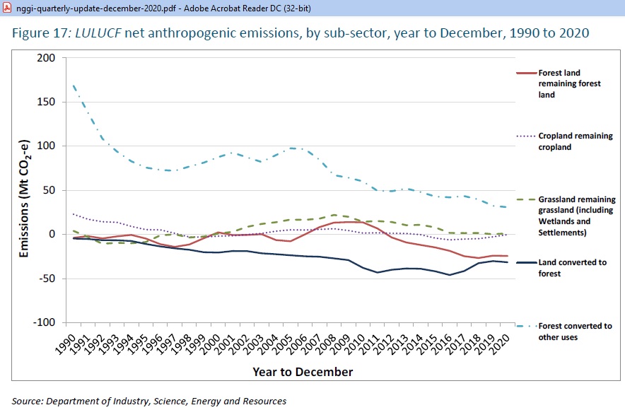 Fig 5: Annual LULUCF emissions by type
We have to put these data into a stacked column graph to understand how the 2006/07 peak came about
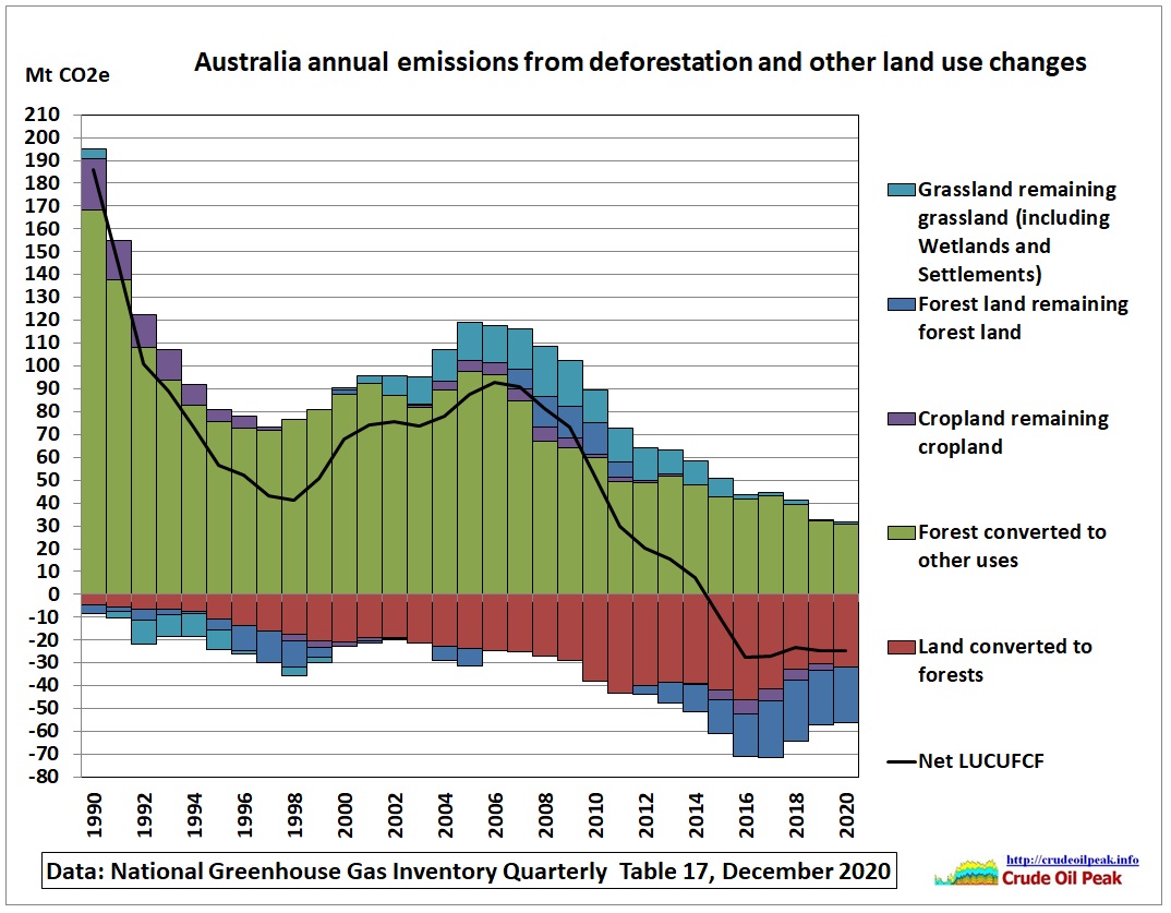 Fig 6: Stacked LULUCF graph
After a sharp decline in the early 1990s (declines in land clearing) there was a resurgence of deforestation just after the Kyoto Protocol was adopted in 1997 with a net LULUCF peak at 93 Mt CO2e in 2006 or 23.2 Mt per quarter (compare to Fig 4)
Emissions excluding LULUCF slightly INCREASED from 547 Mt in 2007 (a maximum in the 1st decade) to 550 Mt in 2019 (0.5%). Only Covid brought emissions down to 523 Mt in 2020 (-4.3% from 2007) mainly due to a reduction in transport emissions.
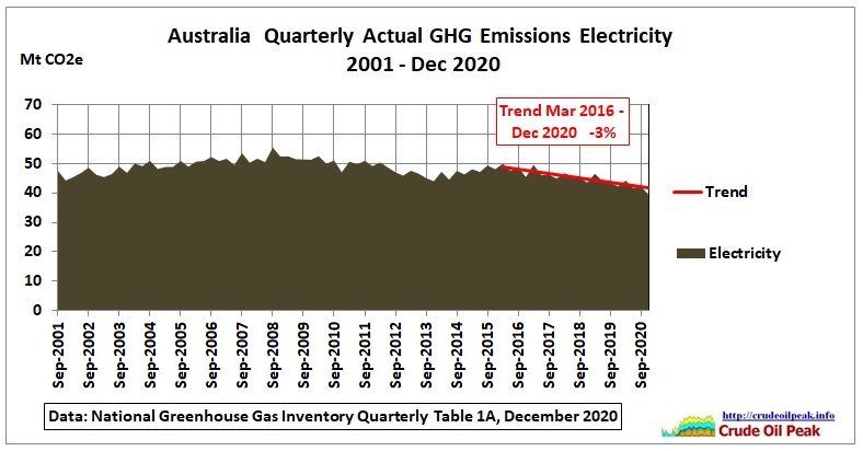 Fig 7: Emissions from electricity generation
Between 2016 and 2019 there was a decline of -3% pa which continued into 2020. La Nina started in September 2020 and reached moderate strength by the end of 2020, resulting in slightly cooler temperatures.
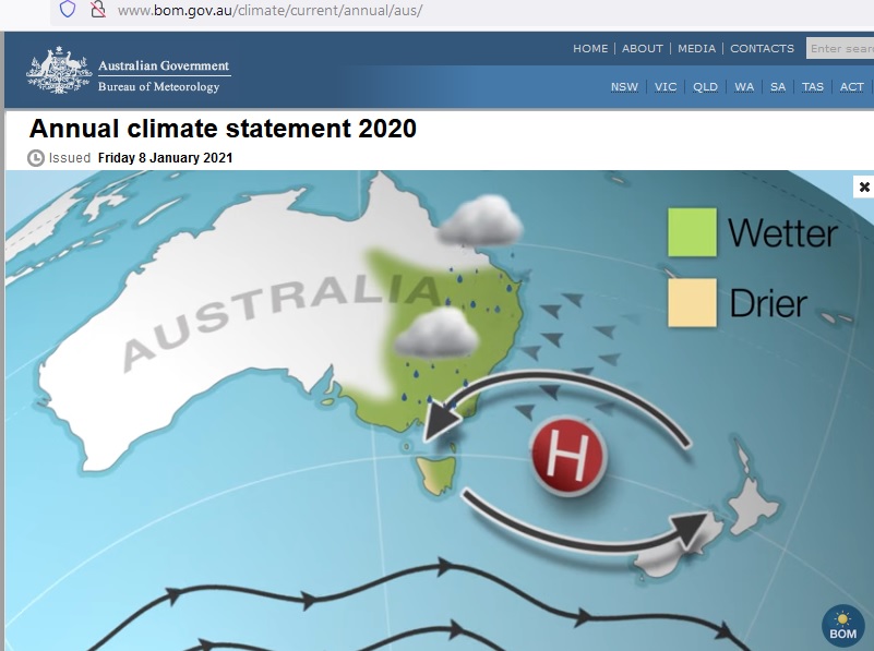 Fig 8: Off shore high pressure system …..
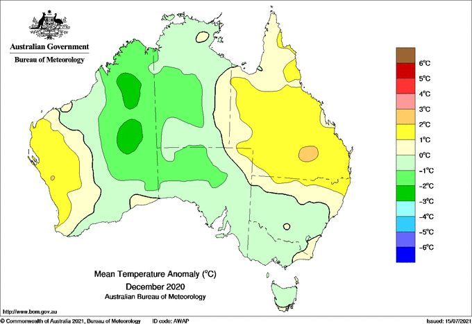 Fig 9: ….bringing cooler air from the ocean into South East Australia
http://www.bom.gov.au/climate/current/month/aus/archive/202012.summary.shtml
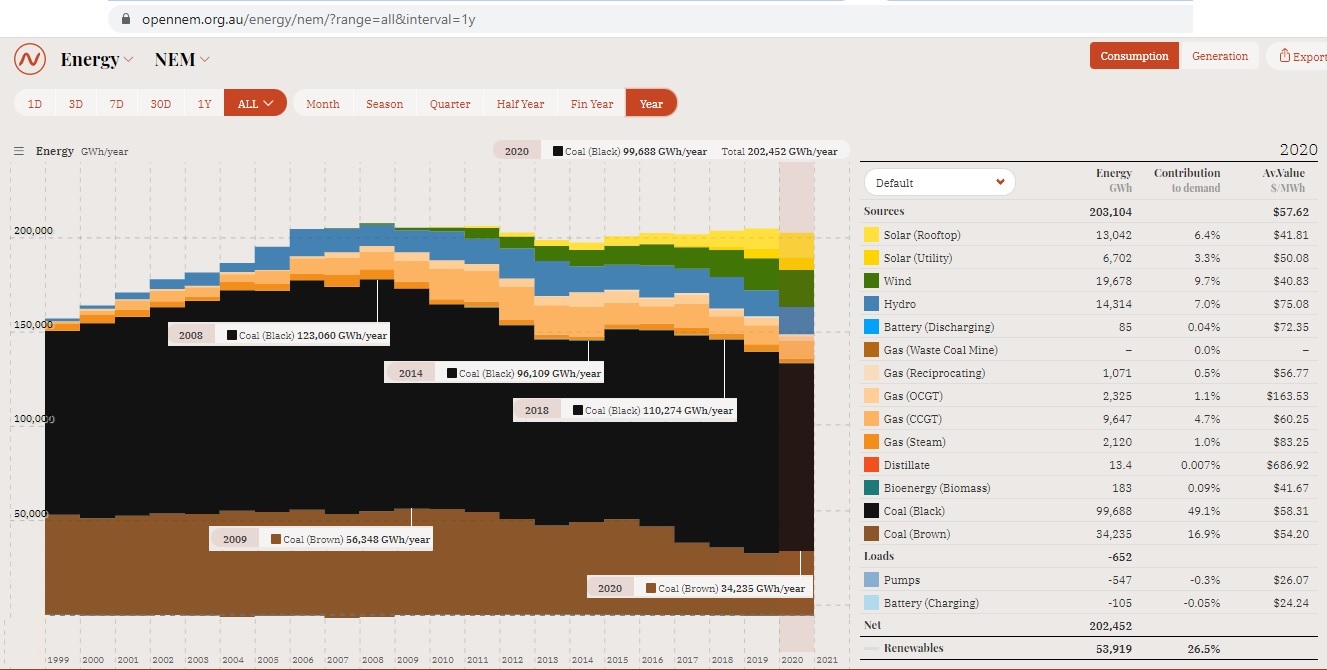 Fig 10: NEM power generation by fuel
Both brown and black coal generation (measured in MWh pa) declined albeit with a rebound between 2014 and 2018. It was replaced by wind and solar power.
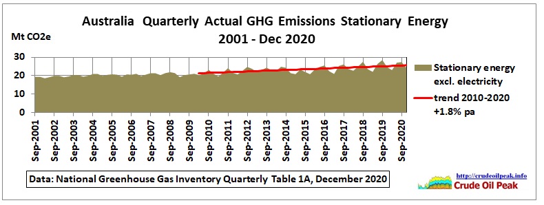 Fig 8: Emissions from stationary energy (excluding electricity)
Stationary energy emissions come from the direct combustion of fuels, predominantly from the manufacturing, mining, residential and commercial sectors.
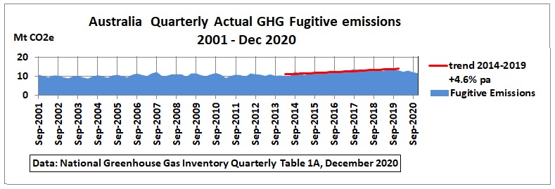 Fig 9: Fugitive emissions
Fugitive methane emissions come from all gas infrastructure (including LNG plants, coal seam gas wells and coal mines). More details can be found in a CSIRO report:
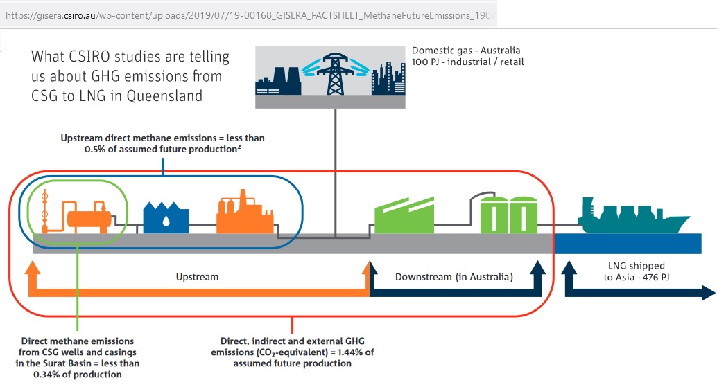 Fig 10: Sources of methane fugitive emissions
https://gisera.csiro.au/factsheet/fugitive-methane-emissions-factsheet/
Let’s zoom into the years 2019-2020 and include the 1st quarter 2021:
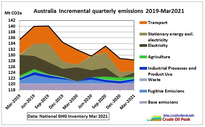 Fig 11: Comparison emissions before and during Covid (stacked)
Incremental emissions focus on the changes in a certain period and are calculated as follows: for each type of emission, the minimum in the period is deducted from the monthly emissions and accumulated in the base emissions (which do not change)
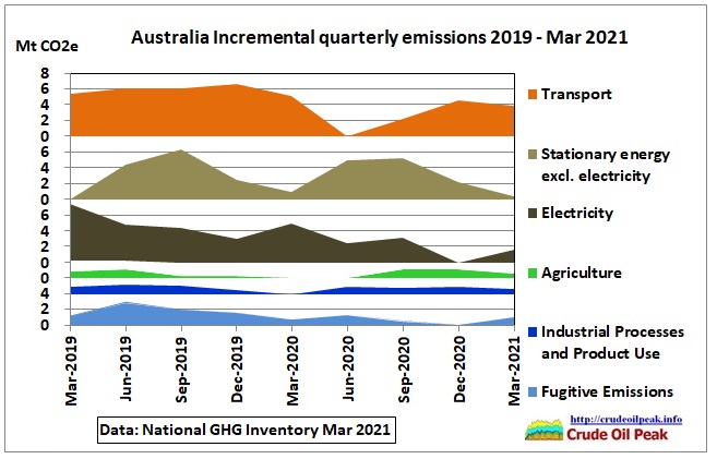 Fig 12: Comparison of emissions before and during Covid
The biggest reduction was in transport in the June 2020 quarter. But there was a bounce back by the end of the year. Lockdowns reduce traffic but there are more on-line deliveries by vans and small trucks. Many PT users will have switched to cars as this is safer.
Stationary energy follows seasonal patterns while electricity emissions are down, helped by the closure of many businesses.
To be continued. The next post on this topic will be about the Kyoto Protocol and how that connects to Fig 2.